Quantcast
Channel: ComponentSource News | ComponentOne Ultimate
Viewing all 166 articles
Browse latest View live

Wijmo Core 2018 v3

$
0
0
Wijmo Core.

Includes Web Workers, new OLAP features, a Ribbon sample, accessibility improvements and more.

Features

  • Faster PDF Export with Web Workers
    • PDF export can often slow down web apps: since the export is happening in the browser’s UI thread, it can cause the rest of the application to be unusable. This is where Web Workers comes to the rescue. We used Web Workers to process the exporting of PDF files on a separate thread from the application UI. This allows the applications to stay usable and the PDF export to churn along in the “background”.
  • Group Headers in ComboBox/ListBox
    • We've added a showGroups property that you can use to add group headers to ListBox and ComboBox controls. Group header items are added if the showGroups property is set to true and the itemsSource collection has grouping enabled.
  • Ribbon Sample using TabPanel
    • We’ve added a ribbon sample that shows how you can create ribbons easily using the TabPanel control and the controls in Wijmo's input module.
    • The ribbon element is a TabPanel. The tab pages contain groups of controls arranged in rows and columns. Controls in the groups use Material Icons, and have tooltips created automatically based on the aria-label attribute assigned to each control.
  • Slicer for OLAP
    • We have added a Slicer control to our OLAP module. The Slicer control provides a quick way to edit filters applied to PivotField objects.
    • It provides buttons the user can click to filter data based on values and indicates the current filtering state, which makes it easy to understand what is shown in filtered PivotGrid and PivotChart controls.
  • Detail Dialog API in OLAP
    • The Wijmo PivotGrid allows you to drill down into cells to see the data items that were used to calculate each summary. Users can invoke the detail dialog by double-clicking any value cell. You can also invoke the detail dialog by calling the grid's showDetail method and passing the coordinates of the cell.
    • Now, the grid exposes the detail dialog through its detailDialog property, which can be used to customize the dialog.
  • Calculated Fields in OLAP
    • We also added a PivotField.getValue property to OLAP that allows you to specify a custom function to be used for retrieving the field value for a given item. You can use this to implement calculated fields such as 'binning' (e.g. Value => large/medium/small) or calculated expressions (e.g Conversion => downloads/sales).
  • Year Picker in Calendar
    • We added a small but useful feature in our Calendar and InputDate controls. You can now click on the year header to open a year picker that allows you to much more easily jump to different years. This little enhancement should save your end users some time when selecting dates.
  • Submenu Support Added to Menu
    • We got this request from a customer and thought it was a great idea. Our Menu control now supports adding multiple submenus to it so that you can create more complex menus and context menus. We also added an option to open menus on hover.
  • Looking for Angular 7 Support?
    • We're very excited about Angular 7, and as you know, Wijmo has first-class Angular support. We're happy to announce that Wijmo supports Angular 7, so you can use the current version of Wijmo to build Angular 7 applications today.
  • New Samples
    • WebComponentsIntro
    • MyBI
    • Ribbon Control Example
    • Slicer for OLAP
    • OLAP Detail Dialog
    • Group Headers in ComboBox
    • HierarchicalMenu

ComponentOne Ultimate - Includes Wijmo 2018 v3

$
0
0
New features in Wijmo 2018 v3 .

Wijmo Core adds Web Workers, new OLAP features, a Ribbon sample, accessibility improvements and more.

Features

Updates in Wijmo Core 2018 v3

  • Faster PDF Export with Web Workers
    • PDF export can often slow down web apps: since the export is happening in the browser’s UI thread, it can cause the rest of the application to be unusable. This is where Web Workers comes to the rescue. We used Web Workers to process the exporting of PDF files on a separate thread from the application UI. This allows the applications to stay usable and the PDF export to churn along in the “background”.
  • Group Headers in ComboBox/ListBox
    • We've added a showGroups property that you can use to add group headers to ListBox and ComboBox controls. Group header items are added if the showGroups property is set to true and the itemsSource collection has grouping enabled.
  • Ribbon Sample using TabPanel
    • We’ve added a ribbon sample that shows how you can create ribbons easily using the TabPanel control and the controls in Wijmo's input module.
    • The ribbon element is a TabPanel. The tab pages contain groups of controls arranged in rows and columns. Controls in the groups use Material Icons, and have tooltips created automatically based on the aria-label attribute assigned to each control.
  • Slicer for OLAP
    • We have added a Slicer control to our OLAP module. The Slicer control provides a quick way to edit filters applied to PivotField objects.
    • It provides buttons the user can click to filter data based on values and indicates the current filtering state, which makes it easy to understand what is shown in filtered PivotGrid and PivotChart controls.
  • Detail Dialog API in OLAP
    • The Wijmo PivotGrid allows you to drill down into cells to see the data items that were used to calculate each summary. Users can invoke the detail dialog by double-clicking any value cell. You can also invoke the detail dialog by calling the grid's showDetail method and passing the coordinates of the cell.
    • Now, the grid exposes the detail dialog through its detailDialog property, which can be used to customize the dialog.
  • Calculated Fields in OLAP
    • We also added a PivotField.getValue property to OLAP that allows you to specify a custom function to be used for retrieving the field value for a given item. You can use this to implement calculated fields such as 'binning' (e.g. Value => large/medium/small) or calculated expressions (e.g Conversion => downloads/sales).
  • Year Picker in Calendar
    • We added a small but useful feature in our Calendar and InputDate controls. You can now click on the year header to open a year picker that allows you to much more easily jump to different years. This little enhancement should save your end users some time when selecting dates.
  • Submenu Support Added to Menu
    • We got this request from a customer and thought it was a great idea. Our Menu control now supports adding multiple submenus to it so that you can create more complex menus and context menus. We also added an option to open menus on hover.
  • Looking for Angular 7 Support?
    • We're very excited about Angular 7, and as you know, Wijmo has first-class Angular support. We're happy to announce that Wijmo supports Angular 7, so you can use the current version of Wijmo to build Angular 7 applications today.
  • New Samples
    • WebComponentsIntro
    • MyBI
    • Ribbon Control Example
    • Slicer for OLAP
    • OLAP Detail Dialog
    • Group Headers in ComboBox
    • HierarchicalMenu

ComponentOne Studio WinForms 2018 v3

$
0
0
New Material Theme Designer in C1 Studio for WinForms.

New Material Theme Designer, Sparkline control and FlexGrid integration, plus DataFilter control beta release.

Features

  • New Material Theme Designer - In addition to adding Material, Material Dark, and Office 2016 Excel Green themes, WinForms now features a Material Theme Designer sample that allows you to set the primary and accent colours of Material theme and save\load them in C1themes format.
  • New DataFilter control (beta) - A powerful UI addition, the DataFilter provides an easy, ecommerce-like filter to accompany any data-aware control. You can create filters from datasources, autogenerated, or create them manually. The accordion-based filtering UI can be attached to any control sharing a datasource or plugged into an info screen. The DataFilter is in beta mode and will be launched in 2019 v1.
  • New Sparkline control and FlexGrid integration - This lightweight sparkline chart control represents the general shape of data variation in a condensed visual. It's often embedded in grids, and as such, FlexGrid can now display sparklines in columns, and it's now easier to plot trends inside FlexGrid cells. The sparkline property of the FlexGrid column supports plotting line, column, and WinLoss sparklines. You can further customize these sparklines by setting the Axis, markers, and series colours among others.
  • FlexGrid now supports SortInfo and GroupInfo, so column information can now be saved and loaded.
  • Scheduler's table and agenda views are now launched and out of beta.
  • FlexChart now supports animation when loading, updating, and adding new data.

ComponentOne Studio WPF 2018 v3

$
0
0
Simplified Ribbon Control in C1 Studio for WPF.

Adds Simplified Ribbon contol, new FlexGrid101 Samples, customized icons, plus updates to Scheduler.

Features

  • Simplified WPF Ribbon - Improve the look and navigation of your WPF apps with the modern, minimalistic simplified ribbon. This new control occupies the middle ground between a ribbon a toolbar, providing a single-line collapsed state, or a three-line ribbon-like appearance, and its design is influenced by Microsoft's ever-evolving Office 365 ribbon. You can customize the style of the ribbon, as well as the buttons you'd like to include.
  • FlexGrid101 Samples - Added a new C1Icon that enables a new level of customization for the sort, filter, and grouping glyphs, as well as FlexGrid101 samples to make it even easier to get started with this popular control. They demonstrate features like selection, cell customization, conditional formatting, filtering, the RowDetails feature, cell merging, and many other points of interest.
  • C1Icon - A new object that is used within the FlexGrid to make it much easier to customize the many icons used throughout for sorting, filter, etc. C1Icon allows you to specify your own image, font character, or use a built-in template to change the appearance of the icons found in the data grid.
  • Scheduler Updates:
    • New TableView Scheduler sample displays appointments in a table view that can be grouped, sorted, or filtered as specified by the developer or end user. It's similar to the Outlook 2016 List and Active views:
    • AgendaView displays appointments grouped by date in a table view where a single table row represents a single appointment. Users can edit appointments by double-clicking on an appointment and opening the EditAppointment dialog. This view is always sorted by dates in ascending order, and doesn't have row or column headers.
    • New "Working Elsewhere" appointment availability status has been added.
  • FlexChart Updates:
    • Animations - FlexChart and Finanical Chart now has animations for loading, updating, and changes to the chart axes. You can also create your own custom animations using the AnimationTransform event.
    • Scale Breaks - FlexChart has also been updated to support axis scale breaks. Scale breaks can make irregular data that varies by a large magnitude easier to read as it makes the lower end of the scale more visible.
    • Ranged drawing mode - allows support for built-in floating bar and Gantt charts. Ranged drawing mode is available for Bar, Column, and Area Charts.
    • UWP controls are now available through NuGet.

ComponentOne Studio ASP.NET MVC 2018 v3

$
0
0
New Flight Statistics sample in C1 Studio ASP.NET MVC.

Adds new Flight Statistics sample, Group Items in ComboBox and ActiveReports support to FlexViewer.

Features

  • New Control Designer for ASP.NET MVC - With the newly-enhanced scaffolders, you can use the control wizard to configure controls when you're not using Entity Framework and generate code for a C1 MVC control. In addition to inserting a new control, this now supports updating an existing control definition using the wizard. This wizard can be invoked through the context menu or through Quick Actions in Razor view. This feature is supported in ASP.NET MVC and ASP.NET Core MVC.
  • New Flight Statistics Sample - This dashboard-style sample displays flight performance data over time. Controls include FlexGrid with sparkline columns for delay trend and KPI columns. A treemap, bar chart, and line symbol chart are used in to display region-wide statistics, and users can drill down to a specific region and city by selecting the data points. On clicking a region in the Total Flights TreeMap, the FlexGrid displays the details of that region.
  • Group items in ComboBox - From the user request folder! With CollectionView already supporting grouping, ComboBox grouping could be implemented with some custom code, but we added this as a simple property in the control itself:
  • ActiveReports added to FlexViewer - In addition to FlexViewer's support for ActiveReports, a new Item Template allows you to quickly configure the viewer in your ASP.NET MVC app.
  • DashboardDemo updated with Material Design - The DashboardDemo has been updated to include Material Design principles and color schemes. In addition, the DashboardLayout control has been added to the dashboard and analysis tabs.
  • FlexGrid Enhancements:
    • Use ColumnGroupProvider to create multi-level merged-cell column headers for groups of related columns.
    • FlexGrid AccessibilityExtender can be used to easily extend accessibility support in one of two ways; Resize columns using the keyboard (alt+left/right keys). Provide an "alert" method that changes the content of an invisible element with the role "alert." This allows assistive tools to announce grid actions like sorting and filtering.

ComponentOne Studio UWP 2018 v3

$
0
0
ComponentOne Studio UWP FlexCharts

New animations for FlexChart and Financial Chart, plus ranged drawing mode for Bar, Column and Area Charts.

Features

  • Simplified WPF Ribbon - Improve the look and navigation of your WPF apps with the modern, minimalistic simplified ribbon. This new control occupies the middle ground between a ribbon a toolbar, providing a single-line collapsed state, or a three-line ribbon-like appearance, and its design is influenced by Microsoft's ever-evolving Office 365 ribbon. You can customize the style of the ribbon, as well as the buttons you'd like to include.
  • FlexGrid101 Samples - Added a new C1Icon that enables a new level of customization for the sort, filter, and grouping glyphs, as well as FlexGrid101 samples to make it even easier to get started with this popular control. They demonstrate features like selection, cell customization, conditional formatting, filtering, the RowDetails feature, cell merging, and many other points of interest.
  • C1Icon - A new object that is used within the FlexGrid to make it much easier to customize the many icons used throughout for sorting, filter, etc. C1Icon allows you to specify your own image, font character, or use a built-in template to change the appearance of the icons found in the data grid.
  • Scheduler Updates:
    • New TableView Scheduler sample displays appointments in a table view that can be grouped, sorted, or filtered as specified by the developer or end user. It's similar to the Outlook 2016 List and Active views:
    • AgendaView displays appointments grouped by date in a table view where a single table row represents a single appointment. Users can edit appointments by double-clicking on an appointment and opening the EditAppointment dialog. This view is always sorted by dates in ascending order, and doesn't have row or column headers.
    • New "Working Elsewhere" appointment availability status has been added.
  • FlexChart Updates:
    • Animations - FlexChart and Finanical Chart now has animations for loading, updating, and changes to the chart axes. You can also create your own custom animations using the AnimationTransform event.
    • Scale Breaks - FlexChart has also been updated to support axis scale breaks. Scale breaks can make irregular data that varies by a large magnitude easier to read as it makes the lower end of the scale more visible.
    • Ranged drawing mode - allows support for built-in floating bar and Gantt charts. Ranged drawing mode is available for Bar, Column, and Area Charts.
    • UWP controls are now available through NuGet.

ComponentOne Studio Enterprise 2018 v3

$
0
0
Material Theme Designer and ASP.NET MVC Control Wizard.

New WinForms Material Theme Designer, Simplified Ribbon contol for WPF and Control Wizard for ASP.NET MVC.

Features

Updates in WinForms

  • New Material Theme Designer - In addition to adding Material, Material Dark, and Office 2016 Excel Green themes, WinForms now features a Material Theme Designer sample that allows you to set the primary and accent colours of Material theme and save\load them in C1themes format.
  • New DataFilter control (beta) - A powerful UI addition, the DataFilter provides an easy, ecommerce-like filter to accompany any data-aware control. You can create filters from datasources, autogenerated, or create them manually. The accordion-based filtering UI can be attached to any control sharing a datasource or plugged into an info screen. The DataFilter is in beta mode and will be launched in 2019 v1.
  • New Sparkline control and FlexGrid integration - This lightweight sparkline chart control represents the general shape of data variation in a condensed visual. It's often embedded in grids, and as such, FlexGrid can now display sparklines in columns, and it's now easier to plot trends inside FlexGrid cells. The sparkline property of the FlexGrid column supports plotting line, column, and WinLoss sparklines. You can further customize these sparklines by setting the Axis, markers, and series colours among others.
  • FlexGrid now supports SortInfo and GroupInfo, so column information can now be saved and loaded.
  • Scheduler's table and agenda views are now launched and out of beta.
  • FlexChart now supports animation when loading, updating, and adding new data.

Updates in WPF and UWP

  • Simplified WPF Ribbon - Improve the look and navigation of your WPF apps with the modern, minimalistic simplified ribbon. This new control occupies the middle ground between a ribbon a toolbar, providing a single-line collapsed state, or a three-line ribbon-like appearance, and its design is influenced by Microsoft's ever-evolving Office 365 ribbon. You can customize the style of the ribbon, as well as the buttons you'd like to include.
  • FlexGrid101 Samples - Added a new C1Icon that enables a new level of customization for the sort, filter, and grouping glyphs, as well as FlexGrid101 samples to make it even easier to get started with this popular control. They demonstrate features like selection, cell customization, conditional formatting, filtering, the RowDetails feature, cell merging, and many other points of interest.
  • C1Icon - A new object that is used within the FlexGrid to make it much easier to customize the many icons used throughout for sorting, filter, etc. C1Icon allows you to specify your own image, font character, or use a built-in template to change the appearance of the icons found in the data grid.
  • Scheduler Updates:
    • New TableView Scheduler sample displays appointments in a table view that can be grouped, sorted, or filtered as specified by the developer or end user. It's similar to the Outlook 2016 List and Active views:
    • AgendaView displays appointments grouped by date in a table view where a single table row represents a single appointment. Users can edit appointments by double-clicking on an appointment and opening the EditAppointment dialog. This view is always sorted by dates in ascending order, and doesn't have row or column headers.
    • New "Working Elsewhere" appointment availability status has been added.
  • FlexChart Updates:
    • Animations - FlexChart and Finanical Chart now has animations for loading, updating, and changes to the chart axes. You can also create your own custom animations using the AnimationTransform event.
    • Scale Breaks - FlexChart has also been updated to support axis scale breaks. Scale breaks can make irregular data that varies by a large magnitude easier to read as it makes the lower end of the scale more visible.
    • Ranged drawing mode - allows support for built-in floating bar and Gantt charts. Ranged drawing mode is available for Bar, Column, and Area Charts.
    • UWP controls are now available through NuGet.

Updates in ASP.NET MVC

  • New Control Designer for ASP.NET MVC - With the newly-enhanced scaffolders, you can use the control wizard to configure controls when you're not using Entity Framework and generate code for a C1 MVC control. In addition to inserting a new control, this now supports updating an existing control definition using the wizard. This wizard can be invoked through the context menu or through Quick Actions in Razor view. This feature is supported in ASP.NET MVC and ASP.NET Core MVC.
  • New Flight Statistics Sample - This dashboard-style sample displays flight performance data over time. Controls include FlexGrid with sparkline columns for delay trend and KPI columns. A treemap, bar chart, and line symbol chart are used in to display region-wide statistics, and users can drill down to a specific region and city by selecting the data points. On clicking a region in the Total Flights TreeMap, the FlexGrid displays the details of that region.
  • Group items in ComboBox - From the user request folder! With CollectionView already supporting grouping, ComboBox grouping could be implemented with some custom code, but we added this as a simple property in the control itself:
  • ActiveReports added to FlexViewer - In addition to FlexViewer's support for ActiveReports, a new Item Template allows you to quickly configure the viewer in your ASP.NET MVC app.
  • DashboardDemo updated with Material Design - The DashboardDemo has been updated to include Material Design principles and color schemes. In addition, the DashboardLayout control has been added to the dashboard and analysis tabs.
  • FlexGrid Enhancements:
    • Use ColumnGroupProvider to create multi-level merged-cell column headers for groups of related columns.
    • FlexGrid AccessibilityExtender can be used to easily extend accessibility support in one of two ways; Resize columns using the keyboard (alt+left/right keys). Provide an "alert" method that changes the content of an invisible element with the role "alert." This allows assistive tools to announce grid actions like sorting and filtering.

ComponentOne Ultimate 2018 v3

$
0
0
ComponentOne Ultimate

New Simplified Ribbon for WPF, Control Wizard for ASP.NET MVC, plus updates to WinForms and UWP controls.

Features

Updates in WinForms

  • New Material Theme Designer - In addition to adding Material, Material Dark, and Office 2016 Excel Green themes, WinForms now features a Material Theme Designer sample that allows you to set the primary and accent colours of Material theme and save\load them in C1themes format.
  • New DataFilter control (beta) - A powerful UI addition, the DataFilter provides an easy, ecommerce-like filter to accompany any data-aware control. You can create filters from datasources, autogenerated, or create them manually. The accordion-based filtering UI can be attached to any control sharing a datasource or plugged into an info screen. The DataFilter is in beta mode and will be launched in 2019 v1.
  • New Sparkline control and FlexGrid integration - This lightweight sparkline chart control represents the general shape of data variation in a condensed visual. It's often embedded in grids, and as such, FlexGrid can now display sparklines in columns, and it's now easier to plot trends inside FlexGrid cells. The sparkline property of the FlexGrid column supports plotting line, column, and WinLoss sparklines. You can further customize these sparklines by setting the Axis, markers, and series colours among others.
  • FlexGrid now supports SortInfo and GroupInfo, so column information can now be saved and loaded.
  • Scheduler's table and agenda views are now launched and out of beta.
  • FlexChart now supports animation when loading, updating, and adding new data.

Updates in WPF and UWP

  • Simplified WPF Ribbon - Improve the look and navigation of your WPF apps with the modern, minimalistic simplified ribbon. This new control occupies the middle ground between a ribbon a toolbar, providing a single-line collapsed state, or a three-line ribbon-like appearance, and its design is influenced by Microsoft's ever-evolving Office 365 ribbon. You can customize the style of the ribbon, as well as the buttons you'd like to include.
  • FlexGrid101 Samples - Added a new C1Icon that enables a new level of customization for the sort, filter, and grouping glyphs, as well as FlexGrid101 samples to make it even easier to get started with this popular control. They demonstrate features like selection, cell customization, conditional formatting, filtering, the RowDetails feature, cell merging, and many other points of interest.
  • C1Icon - A new object that is used within the FlexGrid to make it much easier to customize the many icons used throughout for sorting, filter, etc. C1Icon allows you to specify your own image, font character, or use a built-in template to change the appearance of the icons found in the data grid.
  • Scheduler Updates:
    • New TableView Scheduler sample displays appointments in a table view that can be grouped, sorted, or filtered as specified by the developer or end user. It's similar to the Outlook 2016 List and Active views:
    • AgendaView displays appointments grouped by date in a table view where a single table row represents a single appointment. Users can edit appointments by double-clicking on an appointment and opening the EditAppointment dialog. This view is always sorted by dates in ascending order, and doesn't have row or column headers.
    • New "Working Elsewhere" appointment availability status has been added.
  • FlexChart Updates:
    • Animations - FlexChart and Finanical Chart now has animations for loading, updating, and changes to the chart axes. You can also create your own custom animations using the AnimationTransform event.
    • Scale Breaks - FlexChart has also been updated to support axis scale breaks. Scale breaks can make irregular data that varies by a large magnitude easier to read as it makes the lower end of the scale more visible.
    • Ranged drawing mode - allows support for built-in floating bar and Gantt charts. Ranged drawing mode is available for Bar, Column, and Area Charts.
    • UWP controls are now available through NuGet.

Updates in ASP.NET MVC

  • New Control Designer for ASP.NET MVC - With the newly-enhanced scaffolders, you can use the control wizard to configure controls when you're not using Entity Framework and generate code for a C1 MVC control. In addition to inserting a new control, this now supports updating an existing control definition using the wizard. This wizard can be invoked through the context menu or through Quick Actions in Razor view. This feature is supported in ASP.NET MVC and ASP.NET Core MVC.
  • New Flight Statistics Sample - This dashboard-style sample displays flight performance data over time. Controls include FlexGrid with sparkline columns for delay trend and KPI columns. A treemap, bar chart, and line symbol chart are used in to display region-wide statistics, and users can drill down to a specific region and city by selecting the data points. On clicking a region in the Total Flights TreeMap, the FlexGrid displays the details of that region.
  • Group items in ComboBox - From the user request folder! With CollectionView already supporting grouping, ComboBox grouping could be implemented with some custom code, but we added this as a simple property in the control itself:
  • ActiveReports added to FlexViewer - In addition to FlexViewer's support for ActiveReports, a new Item Template allows you to quickly configure the viewer in your ASP.NET MVC app.
  • DashboardDemo updated with Material Design - The DashboardDemo has been updated to include Material Design principles and color schemes. In addition, the DashboardLayout control has been added to the dashboard and analysis tabs.
  • FlexGrid Enhancements:
    • Use ColumnGroupProvider to create multi-level merged-cell column headers for groups of related columns.
    • FlexGrid AccessibilityExtender can be used to easily extend accessibility support in one of two ways; Resize columns using the keyboard (alt+left/right keys). Provide an "alert" method that changes the content of an invisible element with the role "alert." This allows assistive tools to announce grid actions like sorting and filtering.

Wijmo Core 2018 v3 (Build 568)

$
0
0
FlexSheet sorting example in Wijmo.

Includes improvements to FlexGrid, plus a critical bug fix for FlexSheet.

Features

  • Added two new LearnWijmo fiddles that highlight the FlexGrid’s basic and advanced features.
  • Added a cssClassAll property to the FlexGrid's Row and Column classes so you can add CSS classes to header cells as well as to data cells.
  • Added two new settings to the wijmo.olap.ShowAs enumeration: PctPrevRow and PctPrevCol cause the engine to show values for each item as a percentage of the value in the previous row or column.
  • Added two extra parameters to the FlexGrid.getClipString method so it can be used to export to CSV (instead of tab-delimited text) and to optionally include column headers.
  • Added a Tooltip.cssClass property to allow different types of tooltips to use different styles (e.g. information, validation, etc)
  • Improved the ComboBox.selectedValue property to get or set the control's text when it has no itemsSource. This makes it easier to use the ComboBox as a replacement for regular input elements (and leverage wijmo's infrastructure including styling).
  • Added a new "exclusiveValueSearch" property to the PivotEngine and FlexGridFilter classes. This new property is set to true by default, which enables an Excel-like behavior (searching excludes items from the filter). Set it to false to disable this, so searching only affects which items are displayed on the list, and not which items are included in the filter.
  • [AngularJS] Added auto-size-rows boolean property to the wj-flex-grid-cell-template directive, which is being set to false disables the default behavior where the cell template increases grid's default row height to accommodate cells content.
  • Improved the FlexGrid IME handling to start editing on Unicode spaces as well as regular spaces.
  • [WebComponents] Added Beta version of the WebComponents interop (wijmo.webcomponents.568.js modules). The Samples\TS\WebComponents\WebComponentsIntro sample explains the status and usage of the interop.
  • New Samples
    • FlexGrid basic features | Advanced features
    • OLAP ShowAs sample
    • CSV Export sample

Fixes

  • Fixes a critical bug in FlexSheet. The issue was prominent in the Angular interop and in some other cases, when a Sheet itemsSource was being bound without the Sheet being owned by a FlexSheet instance.

A Guide to Angular Security and Authentication with JSON Web Tokens

$
0
0

GrapeCity blog post to help you circumvent vulnerabilities that can occur with Angular.

Angular is a great platform for building responsive, universal Single Page Applications. In this blog post, GrapeCity content contributor Limor Wainstein takes you through the common vulnerabilities that can seep in through obsolete dependencies, bad coding practices, or irregularities in patching updates. Topics covered include:

  1. Preventing Cross-Site Scripting (XSS)
  2. Angular Sanitation and Security Contexts
  3. The Sanitize() Method
  4. Authentication in Angular using JSON Web Tokens
  5. Much more...

View the blog post to learn more about keeping your Angular code secure.

ComponentOne Studio UWP 2019 v1

$
0
0
Full text filter in ComponentOne Studio UWP

Adds Full text filter to FlexGrid for search box style filtering, plus VS 2019 support.

Features

  • SimplifiedRibbon - The Simplified Ribbon has been updated to use C1Icon (with support for image, font, or vector graphics can be used for buttons) and has improved theme support.
  • FlexGrid - Full text filter behaves similarly to a search box. It allows you to highlight any matches that are contained within the FlexGrid. It gives you the option to match case, match whole word, match numbers, and treat spaces as an "And" operator.
  • FlexGrid now allows you to use C1Icon to also configure the GroupExpanded, GroupCollapsed, NewRow, DetailCollapsed, and DetailExpanded icons.
  • New ComponentOne Control Panel - provides a new way to install, update, license, and maintain your ComponentOne libraries. It also provides fast access to samples, and support.
  • Adds support for Microsoft Visual Studio 2019.
  • Additional Enhancements
    • FlexSheet adds the ability to update and delete comments, as well as VLOOKUP, HLOOKUP, and NOW functions. The FlexSheet.CalcEngine property is also now public and allows custom expressions.
    • C1Zip adds a new ZipEncoding class. The ZipEncoding.Encoding property specifies encoding used for zip entry names and comments and the default encoding is UTF8.

ComponentOne Studio WPF 2019 v1

$
0
0
Simplified Ribbon Control in C1 Studio for WPF.

Includes updates to FlexGrid, FlexSheet and C1Zip, improves the SimplifiedRibbon, plus adds VS 2019 support.

Features

  • SimplifiedRibbon - The Simplified Ribbon has been updated to use C1Icon (with support for image, font, or vector graphics can be used for buttons) and has improved theme support.
  • FlexGrid - Full text filter behaves similarly to a search box. It allows you to highlight any matches that are contained within the FlexGrid. It gives you the option to match case, match whole word, match numbers, and treat spaces as an "And" operator.
  • FlexGrid now allows you to use C1Icon to also configure the GroupExpanded, GroupCollapsed, NewRow, DetailCollapsed, and DetailExpanded icons.
  • New ComponentOne Control Panel - provides a new way to install, update, license, and maintain your ComponentOne libraries. It also provides fast access to samples, and support.
  • Adds support for Microsoft Visual Studio 2019.
  • Additional Enhancements
    • FlexSheet adds the ability to update and delete comments, as well as VLOOKUP, HLOOKUP, and NOW functions. The FlexSheet.CalcEngine property is also now public and allows custom expressions.
    • C1Zip adds a new ZipEncoding class. The ZipEncoding.Encoding property specifies encoding used for zip entry names and comments and the default encoding is UTF8.

ComponentOne Studio for Xamarin 2019 v1

$
0
0
C1Icon improves support for cross-platform vector graphics.

Adds new animations and export features to FlexGrid, plus updates to Radial Gauge, Input controls and C1 Icon.

Features

  • New ComponentOne Control Panel - provides a new way to install, update, license, and maintain your ComponentOne libraries. It also provides fast access to samples, and support.
  • Adds support for Microsoft Visual Studio 2019.
  • FlexGrid Animations
    • New animations have been added to the grid, including a rip animation when a user long presses over a column, as well as a flowing repositioning animation that triggers as the user drags a column or row to reorient it.
    • A new export feature allows you to easily export your data to text, CSV, and formatted HTML.
  • Radial Gauge - Added a property that allows you to reverse the Radial Gauge’s direction. Rather than draw clockwise for 0 to 360, you can now draw counter clockwise from 360 to 0.
  • Input - All Input controls now support Right To Left (RTL Support). This is important for localizing certain languages, such as Arabic. Layout direction can be changed by setting FlowDirection for any Input control.
  • C1Icon - Added improved support for cross-platform vector graphics via C1PathIcon. Using this path, data can easily be resized or colored within your app.

ComponentOne Studio ASP.NET MVC 2019 v1

$
0
0
New Multi-Column Combo sample for ComponentOne Studio ASP.NET MVC

Includes new OLAP Slicer control, plus new Multi-Column Combo sample for FlexGrid, plus VS 2019 support.

Features

  • New OLAP Slicer control - provides a quick way to edit filters applied to PivotField objects. The Slicer provides buttons that a user an click to filter data based on values, and indicates the current filtering state. This makes it easy to understand what is shown in filtered PivotGrid and PivotChart controls.
  • Multi-Column Combo Sample - This extension control extends the cell dropdown to contain a pageable FlexGrid that displays multiple columns. The MultiColumn Combo control is helpful when users need to see multiple columns to make a decision. The dropdown is also pageable which allows the on-demand loading of data.
  • The Control Wizard has been updated so that you can use OLAP, Tab, and DashboardLayout controls. It provides improved support for licensing and updating project resources and Web.config
  • New ComponentOne Control Panel - provides a new way to install, update, license, and maintain your ComponentOne libraries. It also provides fast access to samples, and support.
  • Adds support for Microsoft Visual Studio 2019.
  • Additional Enhancements
    • FlexGrid adds support for Column Groups with a Column Header template that allows defining hierarchical column structures where some columns contain groups of columns.
    • The is now a Menu.subItemsPath property for the Menu control that allows the creation of hierarchical (multi-level) menus.
    • There is now has a ShowYearPicker property for Calendar and InputDate that causes the calendar to show a list of years when the user clicks the year calendar header.
    • Web API Data storage now supports cloud storages and their CRUD operations.

ComponentOne Studio WinForms 2019 v1

$
0
0
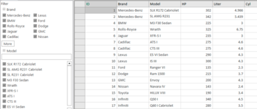
New DataFilter in ComponentOne Studio WinForms.

New DataFilter provides ecommerce-like filtering to any data-aware control, plus VS 2019 support.

Features

  • New DataFilter - A powerful UI addition, the DataFilter provides an easy, ecommerce-like filter to accompany any data-aware control. It makes it easy to filter on criteria such as brand, price, time period, product name, or any other criteria represented in your data. DataFilter works with any data-aware control such as grids, lists, treeview, charts, or maps including standard out-of-the-box Microsoft controls. You can create filters from datasources, whether autogenerated or created manually.
    • Automatically generate a checklist from the main data source when generating a filter.
    • ToolTips support has been added.
    • Added a class to support custom filters.
    • A Calendar filter option has been added.
  • CollectionView Library - Provides a view for grouping, sorting, filtering and navigating a collection.
  • BulletGraph - A BulletGraph is a type of linear gauge designed specifically for use in dashboards and information screens. It displays a single key measure to instantly signal whether a value is good, bad, or in some other state.
  • Data Slicer - The C1FlexPivotSlicer control provides a quick way to edit filters applied to PivotField objects. It allows the user to filter data based on values while also indicating the current filtering state.
  • New ComponentOne Control Panel - provides a new way to install, update, license, and maintain your ComponentOne libraries. It also provides fast access to samples, and support.
  • Adds support for Microsoft Visual Studio 2019.
  • Additional Enhancements
    • FlexPie now supports automatic data label’s placement to avoid overlapping much like FlexChart.
    • A Drawing Tools sample project for FlexChart has been added. It demonstrates actions such as adding/editing chart elements (e.g., annotations, series, trendline) via it's chart toolbar.
    • Input has a new CharHelper class provides methods to flexiblywork with Japanese character sets. For example, it can convert Katakana to Hiragana.
    • Command C1DockingManager.FloatingWindowOptions allows users to change the floating window border style and “close” button behaviour.

ComponentOne Studio Enterprise 2019 v1

$
0
0
ComponentOne Studio Enterprise

Now includes ComponentOne Studio for Xamarin and Wijmo Core, plus support for Microsoft Visual Studio 2019.

Features

Updates in 2019 v1

  • Now includes ComponentOne Studio for Xamarin as well as Wijmo Core.
  • Adds support for Microsoft Visual Studio 2019.
  • New ComponentOne Control Panel - provides a new way to install, update, license, and maintain your ComponentOne libraries. It also provides fast access to samples, and support.

Updates in ComponentOne Studio WinForms 2019 v1

  • Adds support for Microsoft Visual Studio 2019.
  • New ComponentOne Control Panel - provides a new way to install, update, license, and maintain your ComponentOne libraries. It also provides fast access to samples, and support.
  • New DataFilter - A powerful UI addition, the DataFilter provides an easy, ecommerce-like filter to accompany any data-aware control. It makes it easy to filter on criteria such as brand, price, time period, product name, or any other criteria represented in your data. DataFilter works with any data-aware control such as grids, lists, treeview, charts, or maps including standard out-of-the-box Microsoft controls. You can create filters from datasources, whether autogenerated or created manually.
    • Automatically generate a checklist from the main data source when generating a filter.
    • ToolTips support has been added.
    • Added a class to support custom filters.
    • A Calendar filter option has been added.
  • CollectionView Library - Provides a view for grouping, sorting, filtering and navigating a collection.
  • BulletGraph - A BulletGraph is a type of linear gauge designed specifically for use in dashboards and information screens. It displays a single key measure to instantly signal whether a value is good, bad, or in some other state.
  • Data Slicer - The C1FlexPivotSlicer control provides a quick way to edit filters applied to PivotField objects. It allows the user to filter data based on values while also indicating the current filtering state.
  • Additional Enhancements
    • FlexPie now supports automatic data label’s placement to avoid overlapping much like FlexChart.
    • A Drawing Tools sample project for FlexChart has been added. It demonstrates actions such as adding/editing chart elements (e.g., annotations, series, trendline) via it's chart toolbar.
    • Input has a new CharHelper class provides methods to flexiblywork with Japanese character sets. For example, it can convert Katakana to Hiragana.
    • Command C1DockingManager.FloatingWindowOptions allows users to change the floating window border style and “close” button behaviour.

Updates in ComponentOne Studio ASP.NET MVC 2019 v1

  • New OLAP Slicer control - provides a quick way to edit filters applied to PivotField objects. The Slicer provides buttons that a user an click to filter data based on values, and indicates the current filtering state. This makes it easy to understand what is shown in filtered PivotGrid and PivotChart controls.
  • Multi-Column Combo Sample - This extension control extends the cell dropdown to contain a pageable FlexGrid that displays multiple columns. The MultiColumn Combo control is helpful when users need to see multiple columns to make a decision. The dropdown is also pageable which allows the on-demand loading of data.
  • The Control Wizard has been updated so that you can use OLAP, Tab, and DashboardLayout controls. It provides improved support for licensing and updating project resources and Web.config
  • Additional Enhancements
    • FlexGrid adds support for Column Groups with a Column Header template that allows defining hierarchical column structures where some columns contain groups of columns.
    • The is now a Menu.subItemsPath property for the Menu control that allows the creation of hierarchical (multi-level) menus.
    • There is now has a ShowYearPicker property for Calendar and InputDate that causes the calendar to show a list of years when the user clicks the year calendar header.
    • Web API Data storage now supports cloud storages and their CRUD operations.

Updates in ComponentOne Studio UWP 2019 v1

  • SimplifiedRibbon - The Simplified Ribbon has been updated to use C1Icon (with support for image, font, or vector graphics can be used for buttons) and has improved theme support.
  • FlexGrid - Full text filter behaves similarly to a search box. It allows you to highlight any matches that are contained within the FlexGrid. It gives you the option to match case, match whole word, match numbers, and treat spaces as an "And" operator.
  • FlexGrid now allows you to use C1Icon to also configure the GroupExpanded, GroupCollapsed, NewRow, DetailCollapsed, and DetailExpanded icons.
  • Additional Enhancements
    • FlexSheet adds the ability to update and delete comments, as well as VLOOKUP, HLOOKUP, and NOW functions. The FlexSheet.CalcEngine property is also now public and allows custom expressions.
    • C1Zip adds a new ZipEncoding class. The ZipEncoding.Encoding property specifies encoding used for zip entry names and comments and the default encoding is UTF8.

Updates in ComponentOne Studio WPF 2019 v1

  • SimplifiedRibbon - The Simplified Ribbon has been updated to use C1Icon (with support for image, font, or vector graphics can be used for buttons) and has improved theme support.
  • FlexGrid - Full text filter behaves similarly to a search box. It allows you to highlight any matches that are contained within the FlexGrid. It gives you the option to match case, match whole word, match numbers, and treat spaces as an "And" operator.
  • FlexGrid now allows you to use C1Icon to also configure the GroupExpanded, GroupCollapsed, NewRow, DetailCollapsed, and DetailExpanded icons.
  • Additional Enhancements
    • FlexSheet adds the ability to update and delete comments, as well as VLOOKUP, HLOOKUP, and NOW functions. The FlexSheet.CalcEngine property is also now public and allows custom expressions.
    • C1Zip adds a new ZipEncoding class. The ZipEncoding.Encoding property specifies encoding used for zip entry names and comments and the default encoding is UTF8.

Updates in ComponentOne Studio for Xamarin 2019 v1

  • FlexGrid Animations
    • New animations have been added to the grid, including a rip animation when a user long presses over a column, as well as a flowing repositioning animation that triggers as the user drags a column or row to reorient it.
    • A new export feature allows you to easily export your data to text, CSV, and formatted HTML.
  • Radial Gauge - Added a property that allows you to reverse the Radial Gauge’s direction. Rather than draw clockwise for 0 to 360, you can now draw counter clockwise from 360 to 0.
  • Input - All Input controls now support Right To Left (RTL Support). This is important for localizing certain languages, such as Arabic. Layout direction can be changed by setting FlowDirection for any Input control.
  • C1Icon - Added improved support for cross-platform vector graphics via C1PathIcon. Using this path, data can easily be resized or colored within your app.

ComponentOne Ultimate 2019 v1

$
0
0
FinancialChart for ASP.NET MVC.

Includes advanced web controls for ASP.NET MVC and JavaScript (OLAP, FlexSheet, MultiRow & Financial Chart).

Features

Updates in 2019 v1

  • Now includes advanced web controls for both ASP.NET MVC and JavaScript (including OLAP, FlexSheet, MultiRow and Financial Chart).
  • Adds support for Microsoft Visual Studio 2019.
  • New ComponentOne Control Panel - provides a new way to install, update, license, and maintain your ComponentOne libraries. It also provides fast access to samples, and support.

Updates in ComponentOne Studio WinForms 2019 v1

  • Adds support for Microsoft Visual Studio 2019.
  • New ComponentOne Control Panel - provides a new way to install, update, license, and maintain your ComponentOne libraries. It also provides fast access to samples, and support.
  • New DataFilter - A powerful UI addition, the DataFilter provides an easy, ecommerce-like filter to accompany any data-aware control. It makes it easy to filter on criteria such as brand, price, time period, product name, or any other criteria represented in your data. DataFilter works with any data-aware control such as grids, lists, treeview, charts, or maps including standard out-of-the-box Microsoft controls. You can create filters from datasources, whether autogenerated or created manually.
    • Automatically generate a checklist from the main data source when generating a filter.
    • ToolTips support has been added.
    • Added a class to support custom filters.
    • A Calendar filter option has been added.
  • CollectionView Library - Provides a view for grouping, sorting, filtering and navigating a collection.
  • BulletGraph - A BulletGraph is a type of linear gauge designed specifically for use in dashboards and information screens. It displays a single key measure to instantly signal whether a value is good, bad, or in some other state.
  • Data Slicer - The C1FlexPivotSlicer control provides a quick way to edit filters applied to PivotField objects. It allows the user to filter data based on values while also indicating the current filtering state.
  • Additional Enhancements
    • FlexPie now supports automatic data label’s placement to avoid overlapping much like FlexChart.
    • A Drawing Tools sample project for FlexChart has been added. It demonstrates actions such as adding/editing chart elements (e.g., annotations, series, trendline) via it's chart toolbar.
    • Input has a new CharHelper class provides methods to flexiblywork with Japanese character sets. For example, it can convert Katakana to Hiragana.
    • Command C1DockingManager.FloatingWindowOptions allows users to change the floating window border style and “close” button behaviour.

Updates in ComponentOne Studio ASP.NET MVC 2019 v1

  • New OLAP Slicer control - provides a quick way to edit filters applied to PivotField objects. The Slicer provides buttons that a user an click to filter data based on values, and indicates the current filtering state. This makes it easy to understand what is shown in filtered PivotGrid and PivotChart controls.
  • Multi-Column Combo Sample - This extension control extends the cell dropdown to contain a pageable FlexGrid that displays multiple columns. The MultiColumn Combo control is helpful when users need to see multiple columns to make a decision. The dropdown is also pageable which allows the on-demand loading of data.
  • The Control Wizard has been updated so that you can use OLAP, Tab, and DashboardLayout controls. It provides improved support for licensing and updating project resources and Web.config
  • Additional Enhancements
    • FlexGrid adds support for Column Groups with a Column Header template that allows defining hierarchical column structures where some columns contain groups of columns.
    • The is now a Menu.subItemsPath property for the Menu control that allows the creation of hierarchical (multi-level) menus.
    • There is now has a ShowYearPicker property for Calendar and InputDate that causes the calendar to show a list of years when the user clicks the year calendar header.
    • Web API Data storage now supports cloud storages and their CRUD operations.

Updates in ComponentOne Studio UWP 2019 v1

  • SimplifiedRibbon - The Simplified Ribbon has been updated to use C1Icon (with support for image, font, or vector graphics can be used for buttons) and has improved theme support.
  • FlexGrid - Full text filter behaves similarly to a search box. It allows you to highlight any matches that are contained within the FlexGrid. It gives you the option to match case, match whole word, match numbers, and treat spaces as an "And" operator.
  • FlexGrid now allows you to use C1Icon to also configure the GroupExpanded, GroupCollapsed, NewRow, DetailCollapsed, and DetailExpanded icons.
  • Additional Enhancements
    • FlexSheet adds the ability to update and delete comments, as well as VLOOKUP, HLOOKUP, and NOW functions. The FlexSheet.CalcEngine property is also now public and allows custom expressions.
    • C1Zip adds a new ZipEncoding class. The ZipEncoding.Encoding property specifies encoding used for zip entry names and comments and the default encoding is UTF8.

Updates in ComponentOne Studio WPF 2019 v1

  • SimplifiedRibbon - The Simplified Ribbon has been updated to use C1Icon (with support for image, font, or vector graphics can be used for buttons) and has improved theme support.
  • FlexGrid - Full text filter behaves similarly to a search box. It allows you to highlight any matches that are contained within the FlexGrid. It gives you the option to match case, match whole word, match numbers, and treat spaces as an "And" operator.
  • FlexGrid now allows you to use C1Icon to also configure the GroupExpanded, GroupCollapsed, NewRow, DetailCollapsed, and DetailExpanded icons.
  • Additional Enhancements
    • FlexSheet adds the ability to update and delete comments, as well as VLOOKUP, HLOOKUP, and NOW functions. The FlexSheet.CalcEngine property is also now public and allows custom expressions.
    • C1Zip adds a new ZipEncoding class. The ZipEncoding.Encoding property specifies encoding used for zip entry names and comments and the default encoding is UTF8.

Updates in ComponentOne Studio for Xamarin 2019 v1

  • FlexGrid Animations
    • New animations have been added to the grid, including a rip animation when a user long presses over a column, as well as a flowing repositioning animation that triggers as the user drags a column or row to reorient it.
    • A new export feature allows you to easily export your data to text, CSV, and formatted HTML.
  • Radial Gauge - Added a property that allows you to reverse the Radial Gauge’s direction. Rather than draw clockwise for 0 to 360, you can now draw counter clockwise from 360 to 0.
  • Input - All Input controls now support Right To Left (RTL Support). This is important for localizing certain languages, such as Arabic. Layout direction can be changed by setting FlowDirection for any Input control.
  • C1Icon - Added improved support for cross-platform vector graphics via C1PathIcon. Using this path, data can easily be resized or colored within your app.

ComponentOne Studio Enterprise - Includes Wijmo 2019 v1

$
0
0
Wijmo samples explorer.

Wijmo adds new features and improvements to FlexGrid, FlexChart, PivotGrid, TreeView, GroupPanel and more.

Wijmo’s first major release of 2019 includes brand new developer resources, customer-requested features, improved components using a new browser API, and more.

Explore Controls & Features in Every Framework.
GrapeCity have consolidated all 500 samples into one place. Each sample is available in the following frameworks:

  • Pure JavaScript, using ES6 modules (no framework)
  • Angular (v2+)
  • Vue (v2+)
  • React

This makes it easy to find any feature you need, try it in the browser, view the source code for your favorite framework, and even make live edits to the code.

New Documentation Guides
GrapeCity have written over 200 new documentation guides that will help walk you through using the controls and implementing features.

New API Reference
GrapeCity have rebuilt their API Reference. They designed it to be consistent with their other new developer resources.

FlexGrid Tooltips
GrapeCity have added a FlexGrid.errorTip property that allows you to specify a Tooltip to use when showing validation errors. You can use this property to customize the tooltip, or set it to null to restore the original behavior.

FlexGrid Excel-like Selection
GrapeCity added an option to FlexGrid called anchorCursor, which changes the range selection to look more like Excel.

Simpler CSS Styling in FlexGrid
GrapeCity refactored and simplified the grid CSS rules so customizing cell backgrounds is now simpler and easier.

FlexGrid Performance
GrapeCity improved the FlexGrid scrolling performance even further by extending the cell reordering logic to work when scrolling horizontally and on grids with frozen cells.

OLAP Outline Mode
GrapeCity added a new PivotGrid.outlineMode property in OLAP. In outline mode, the PivotGrid renders row fields in an outline format that is more compact and reduces the amount of white space shown on the screen.

FlexChart Custom Series
GrapeCity added two new features that make it easier to customize specific series. FlexChart has a new Series.tooltipContent property that allows you to customize tooltips for specific series.

FlexChart Range Area Chart
GrapeCity have added support for range area charts to FlexChart.

Multiple Pie Charts with FlexPie
You can now use FlexPie to visualize more of your data in a single chart by creating multiple pie chart "series" using the same data source.

Better Components with ResizeObserver
In this release, GrapeCity utilize a new browser API called ResizedObserver to improve layout rendering in all of their controls. This API allows them to know when the control element is resized or changes visibility. These events can be used to make sure the control layouts adapt to their container and optimize their layout. Previously, this wasn't possible for GrapeCity to build into the controls, but thanks to this new API, GrapeCity can add this bit of polish.

Wijmo NPM Package Changes
Wijmo npm packages have been moved to the @grapecity scope. This brings benefits like multiple module formats available straight out of public npm, and drastically simplifies Wijmo usage for companies that use to host Wijmo on their private npm servers.

Before now, all Wijmo npm modules have been stored in the single ‘wijmo’ npm package. Now every module is represented as a separate package in the @grapecity scope, like @grapecity/wijmo.input or @grapecity/wijmo.grid.

For the purpose of a smooth transition of your existing applications to the new Wijmo packages, GrapeCity will continue to maintain the non-scoped ‘wijmo’ package for a limited amount of time. This means that the latest Wijmo release versions will be shipped as both scoped and non-scoped packages. But you should schedule an update of your application to use new scoped packages for the nearest time.

Wijmo 2019 v1 Change Log:

  • FlexGrid
    • Added a FlexGrid.errorTip property that allows you to specify a Tooltip to use when showing validation errors. Use this property to customize the tooltip, or set it to null to restore the original behavior (use the cell's "title" attribute to show validation errors)
    • Added an extra parameter to the FlexGrid.getClipString method so it can export row headers (in addition to column headers). This new feature is important for exporting the content of PivotGrid controls for example.
    • Added a FlexGrid.alternatingRowStep property that allows you to specify the number of regular rows that should appear between alternating rows (the default is one; set this property to zero to disable alternating rows or set it to a value greater than one to show multiple regular rows between alternate rows). Note: The alternatingRowStep property replaces/extends the showAlternatingRows property which has been deprecated.
    • Improved the FlexGrid mouse handling logic to prevent sorting columns when clicking column headers that are merged horizontally (because in this case the header refers to multiple columns).
    • Changed the FlexGrid's CSS to use weaker rules for cell styles so they are easier to override.
    • Improved FlexGrid rendering performance by reordering cells when scrolling horizontally.
    • Improved the FlexGridFilter's date/time condition filtering logic.
    • Improved the FlexGridFilter's condition editor by disabling the value editors when no condition is set.
  • GroupPanel
    • Added a GroupPanel.showDragGlyphs property that causes the control to show drag handle glyphs in the group marker elements.
  • PivotGrid
    • Added a PivotGrid.outlineMode property that causes the PivotGrid to show row groups in outline format, allowing for more compact displays.
    • Improved keyboard support in the PivotGrid to allow expanding and collapsing row groups with the keyboard (use alt-Left to collapse, alt-Right to expand).
    • Changed the olap.PivotGrid to honor the allowMerging property. Also changed the default setting of the property to 'AllHeaders'.
    • Added a PivotGrid.showValueFieldHeaders property that causes the grid to show headers for value fields even in views that have a single value field.
  • MultiRow
    • Added support for the MultiRow.newRowAtTop property (in previous versions the new row template was always displayed at the bottom of the MultiRow.
    • Added support for explicitly setting the rowspan in MultiRow cells.
  • FlexChart
    • Added a Series.tooltipContent property that allows you to add tooltips for specific series.
    • Added a Series.itemFormatter property that allows to specify an item formatter function for specific series.
    • Added support for ranged Area charts: this is similar to the support for ranged Bar and Column charts: specify the name of the properties that contain the min and max values in the series binding, e.g. myAreaSeries.binding = "ymin,ymax".
  • TreeView
    • Added a TreeView.expandOnLoad property that determines whether the TreeView should automatically expand the first node when it loads (default behavior) or if all nodes should be initially collapsed.
    • Added a TreeView.checkOnClick property that allows users to check nodes by clicking anywhere on the node header (as opposed to clicking on the checkbox itself).
    • Added a TreeView.checkedMemberPath property that allows you to bind the checkboxes in the TreeView to data members.
  • Menu
    • Added a Menu.closeOnLeave property to work with Menu.openOnHover and provide more control over when menus open and close.
  • PrintDocument
    • Added a PrintDocument.afterPrint event that occurs when the PrintDocument's temporary window raises its afterprint event.

ComponentOne Ultimate - Includes Wijmo 2019 v1

$
0
0
Wijmo samples explorer.

Wijmo adds new features and improvements to FlexGrid, FlexChart, PivotGrid, TreeView, GroupPanel and more.

Wijmo’s first major release of 2019 includes brand new developer resources, customer-requested features, improved components using a new browser API, and more.

Explore Controls & Features in Every Framework.
GrapeCity have consolidated all 500 samples into one place. Each sample is available in the following frameworks:

  • Pure JavaScript, using ES6 modules (no framework)
  • Angular (v2+)
  • Vue (v2+)
  • React

This makes it easy to find any feature you need, try it in the browser, view the source code for your favorite framework, and even make live edits to the code.

New Documentation Guides
GrapeCity have written over 200 new documentation guides that will help walk you through using the controls and implementing features.

New API Reference
GrapeCity have rebuilt their API Reference. They designed it to be consistent with their other new developer resources.

FlexGrid Tooltips
GrapeCity have added a FlexGrid.errorTip property that allows you to specify a Tooltip to use when showing validation errors. You can use this property to customize the tooltip, or set it to null to restore the original behavior.

FlexGrid Excel-like Selection
GrapeCity added an option to FlexGrid called anchorCursor, which changes the range selection to look more like Excel.

Simpler CSS Styling in FlexGrid
GrapeCity refactored and simplified the grid CSS rules so customizing cell backgrounds is now simpler and easier.

FlexGrid Performance
GrapeCity improved the FlexGrid scrolling performance even further by extending the cell reordering logic to work when scrolling horizontally and on grids with frozen cells.

OLAP Outline Mode
GrapeCity added a new PivotGrid.outlineMode property in OLAP. In outline mode, the PivotGrid renders row fields in an outline format that is more compact and reduces the amount of white space shown on the screen.

FlexChart Custom Series
GrapeCity added two new features that make it easier to customize specific series. FlexChart has a new Series.tooltipContent property that allows you to customize tooltips for specific series.

FlexChart Range Area Chart
GrapeCity have added support for range area charts to FlexChart.

Multiple Pie Charts with FlexPie
You can now use FlexPie to visualize more of your data in a single chart by creating multiple pie chart "series" using the same data source.

Better Components with ResizeObserver
In this release, GrapeCity utilize a new browser API called ResizedObserver to improve layout rendering in all of their controls. This API allows them to know when the control element is resized or changes visibility. These events can be used to make sure the control layouts adapt to their container and optimize their layout. Previously, this wasn't possible for GrapeCity to build into the controls, but thanks to this new API, GrapeCity can add this bit of polish.

Wijmo NPM Package Changes
Wijmo npm packages have been moved to the @grapecity scope. This brings benefits like multiple module formats available straight out of public npm, and drastically simplifies Wijmo usage for companies that use to host Wijmo on their private npm servers.

Before now, all Wijmo npm modules have been stored in the single ‘wijmo’ npm package. Now every module is represented as a separate package in the @grapecity scope, like @grapecity/wijmo.input or @grapecity/wijmo.grid.

For the purpose of a smooth transition of your existing applications to the new Wijmo packages, GrapeCity will continue to maintain the non-scoped ‘wijmo’ package for a limited amount of time. This means that the latest Wijmo release versions will be shipped as both scoped and non-scoped packages. But you should schedule an update of your application to use new scoped packages for the nearest time.

Wijmo 2019 v1 Change Log:

  • FlexGrid
    • Added a FlexGrid.errorTip property that allows you to specify a Tooltip to use when showing validation errors. Use this property to customize the tooltip, or set it to null to restore the original behavior (use the cell's "title" attribute to show validation errors)
    • Added an extra parameter to the FlexGrid.getClipString method so it can export row headers (in addition to column headers). This new feature is important for exporting the content of PivotGrid controls for example.
    • Added a FlexGrid.alternatingRowStep property that allows you to specify the number of regular rows that should appear between alternating rows (the default is one; set this property to zero to disable alternating rows or set it to a value greater than one to show multiple regular rows between alternate rows). Note: The alternatingRowStep property replaces/extends the showAlternatingRows property which has been deprecated.
    • Improved the FlexGrid mouse handling logic to prevent sorting columns when clicking column headers that are merged horizontally (because in this case the header refers to multiple columns).
    • Changed the FlexGrid's CSS to use weaker rules for cell styles so they are easier to override.
    • Improved FlexGrid rendering performance by reordering cells when scrolling horizontally.
    • Improved the FlexGridFilter's date/time condition filtering logic.
    • Improved the FlexGridFilter's condition editor by disabling the value editors when no condition is set.
  • GroupPanel
    • Added a GroupPanel.showDragGlyphs property that causes the control to show drag handle glyphs in the group marker elements.
  • PivotGrid
    • Added a PivotGrid.outlineMode property that causes the PivotGrid to show row groups in outline format, allowing for more compact displays.
    • Improved keyboard support in the PivotGrid to allow expanding and collapsing row groups with the keyboard (use alt-Left to collapse, alt-Right to expand).
    • Changed the olap.PivotGrid to honor the allowMerging property. Also changed the default setting of the property to 'AllHeaders'.
    • Added a PivotGrid.showValueFieldHeaders property that causes the grid to show headers for value fields even in views that have a single value field.
  • MultiRow
    • Added support for the MultiRow.newRowAtTop property (in previous versions the new row template was always displayed at the bottom of the MultiRow.
    • Added support for explicitly setting the rowspan in MultiRow cells.
  • FlexChart
    • Added a Series.tooltipContent property that allows you to add tooltips for specific series.
    • Added a Series.itemFormatter property that allows to specify an item formatter function for specific series.
    • Added support for ranged Area charts: this is similar to the support for ranged Bar and Column charts: specify the name of the properties that contain the min and max values in the series binding, e.g. myAreaSeries.binding = "ymin,ymax".
  • TreeView
    • Added a TreeView.expandOnLoad property that determines whether the TreeView should automatically expand the first node when it loads (default behavior) or if all nodes should be initially collapsed.
    • Added a TreeView.checkOnClick property that allows users to check nodes by clicking anywhere on the node header (as opposed to clicking on the checkbox itself).
    • Added a TreeView.checkedMemberPath property that allows you to bind the checkboxes in the TreeView to data members.
  • Menu
    • Added a Menu.closeOnLeave property to work with Menu.openOnHover and provide more control over when menus open and close.
  • PrintDocument
    • Added a PrintDocument.afterPrint event that occurs when the PrintDocument's temporary window raises its afterprint event.

Wijmo Core 2019 v1

$
0
0
Wijmo samples explorer.

Adds new features and improvements to FlexGrid, FlexChart, PivotGrid, TreeView, GroupPanel and more.

Wijmo’s first major release of 2019 includes brand new developer resources, customer-requested features, improved components using a new browser API, and more.

Explore Controls & Features in Every Framework.
GrapeCity have consolidated all 500 samples into one place. Each sample is available in the following frameworks:

  • Pure JavaScript, using ES6 modules (no framework)
  • Angular (v2+)
  • Vue (v2+)
  • React

This makes it easy to find any feature you need, try it in the browser, view the source code for your favorite framework, and even make live edits to the code.

New Documentation Guides
GrapeCity have written over 200 new documentation guides that will help walk you through using the controls and implementing features.

New API Reference
GrapeCity have rebuilt their API Reference. They designed it to be consistent with their other new developer resources.

FlexGrid Tooltips
GrapeCity have added a FlexGrid.errorTip property that allows you to specify a Tooltip to use when showing validation errors. You can use this property to customize the tooltip, or set it to null to restore the original behavior.

FlexGrid Excel-like Selection
GrapeCity added an option to FlexGrid called anchorCursor, which changes the range selection to look more like Excel.

Simpler CSS Styling in FlexGrid
GrapeCity refactored and simplified the grid CSS rules so customizing cell backgrounds is now simpler and easier.

FlexGrid Performance
GrapeCity improved the FlexGrid scrolling performance even further by extending the cell reordering logic to work when scrolling horizontally and on grids with frozen cells.

OLAP Outline Mode
GrapeCity added a new PivotGrid.outlineMode property in OLAP. In outline mode, the PivotGrid renders row fields in an outline format that is more compact and reduces the amount of white space shown on the screen.

FlexChart Custom Series
GrapeCity added two new features that make it easier to customize specific series. FlexChart has a new Series.tooltipContent property that allows you to customize tooltips for specific series.

FlexChart Range Area Chart
GrapeCity have added support for range area charts to FlexChart.

Multiple Pie Charts with FlexPie
You can now use FlexPie to visualize more of your data in a single chart by creating multiple pie chart "series" using the same data source.

Better Components with ResizeObserver
In this release, GrapeCity utilize a new browser API called ResizedObserver to improve layout rendering in all of their controls. This API allows them to know when the control element is resized or changes visibility. These events can be used to make sure the control layouts adapt to their container and optimize their layout. Previously, this wasn't possible for GrapeCity to build into the controls, but thanks to this new API, GrapeCity can add this bit of polish.

Wijmo NPM Package Changes
Wijmo npm packages have been moved to the @grapecity scope. This brings benefits like multiple module formats available straight out of public npm, and drastically simplifies Wijmo usage for companies that use to host Wijmo on their private npm servers.

Before now, all Wijmo npm modules have been stored in the single ‘wijmo’ npm package. Now every module is represented as a separate package in the @grapecity scope, like @grapecity/wijmo.input or @grapecity/wijmo.grid.

For the purpose of a smooth transition of your existing applications to the new Wijmo packages, GrapeCity will continue to maintain the non-scoped ‘wijmo’ package for a limited amount of time. This means that the latest Wijmo release versions will be shipped as both scoped and non-scoped packages. But you should schedule an update of your application to use new scoped packages for the nearest time.

Wijmo 2019 v1 Change Log:

  • FlexGrid
    • Added a FlexGrid.errorTip property that allows you to specify a Tooltip to use when showing validation errors. Use this property to customize the tooltip, or set it to null to restore the original behavior (use the cell's "title" attribute to show validation errors)
    • Added an extra parameter to the FlexGrid.getClipString method so it can export row headers (in addition to column headers). This new feature is important for exporting the content of PivotGrid controls for example.
    • Added a FlexGrid.alternatingRowStep property that allows you to specify the number of regular rows that should appear between alternating rows (the default is one; set this property to zero to disable alternating rows or set it to a value greater than one to show multiple regular rows between alternate rows). Note: The alternatingRowStep property replaces/extends the showAlternatingRows property which has been deprecated.
    • Improved the FlexGrid mouse handling logic to prevent sorting columns when clicking column headers that are merged horizontally (because in this case the header refers to multiple columns).
    • Changed the FlexGrid's CSS to use weaker rules for cell styles so they are easier to override.
    • Improved FlexGrid rendering performance by reordering cells when scrolling horizontally.
    • Improved the FlexGridFilter's date/time condition filtering logic.
    • Improved the FlexGridFilter's condition editor by disabling the value editors when no condition is set.
  • GroupPanel
    • Added a GroupPanel.showDragGlyphs property that causes the control to show drag handle glyphs in the group marker elements.
  • PivotGrid
    • Added a PivotGrid.outlineMode property that causes the PivotGrid to show row groups in outline format, allowing for more compact displays.
    • Improved keyboard support in the PivotGrid to allow expanding and collapsing row groups with the keyboard (use alt-Left to collapse, alt-Right to expand).
    • Changed the olap.PivotGrid to honor the allowMerging property. Also changed the default setting of the property to 'AllHeaders'.
    • Added a PivotGrid.showValueFieldHeaders property that causes the grid to show headers for value fields even in views that have a single value field.
  • MultiRow
    • Added support for the MultiRow.newRowAtTop property (in previous versions the new row template was always displayed at the bottom of the MultiRow.
    • Added support for explicitly setting the rowspan in MultiRow cells.
  • FlexChart
    • Added a Series.tooltipContent property that allows you to add tooltips for specific series.
    • Added a Series.itemFormatter property that allows to specify an item formatter function for specific series.
    • Added support for ranged Area charts: this is similar to the support for ranged Bar and Column charts: specify the name of the properties that contain the min and max values in the series binding, e.g. myAreaSeries.binding = "ymin,ymax".
  • TreeView
    • Added a TreeView.expandOnLoad property that determines whether the TreeView should automatically expand the first node when it loads (default behavior) or if all nodes should be initially collapsed.
    • Added a TreeView.checkOnClick property that allows users to check nodes by clicking anywhere on the node header (as opposed to clicking on the checkbox itself).
    • Added a TreeView.checkedMemberPath property that allows you to bind the checkboxes in the TreeView to data members.
  • Menu
    • Added a Menu.closeOnLeave property to work with Menu.openOnHover and provide more control over when menus open and close.
  • PrintDocument
    • Added a PrintDocument.afterPrint event that occurs when the PrintDocument's temporary window raises its afterprint event.
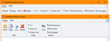
Viewing all 166 articles
Browse latest View live


<script src="https://jsc.adskeeper.com/r/s/rssing.com.1596347.js" async> </script>