Quantcast
Channel: ComponentSource News | ComponentOne Ultimate
Viewing all 166 articles
Browse latest View live

ComponentOne Studio UWP 2018 v1

$
0
0
ComponentOne Studio UWP

New charts and features added to FlexChart, plus an interactive sample explorer, and MultiSelect Input Control.

Features

  • New Control: MultiSelect Input Control is a drop-down control that extends ComboBox and adds checkboxes next to each item in the drop-down list, allowing users to select multiple items from a list.
  • The new C1 Samples Explorer allows users to access samples and demos from a built-in desktop app. When the product installs, users get an additional icon to start up the Samples Explorer. Features allow users to browse and search samples across all platforms, and they can launch the VB or C# script from inside the app. The explorer includes integration into Visual Studio.
  • New charts and features added to the FlexChart include Pareto chart, axis grouping, options for managing overlapping axis and data labels, and custom legend icons.
  • Scheduler
    • Improved appointment layout algorithm for short appointments in views with a small visual scale.
  • Automation
    • Fixed automation issues with FlexGrid, C1TabControl, C1CalendarControl, and C1TileView.
    • Added reference to C1.UWP.Automation to following samples: BasicLibrarySamples, CalendarSamples, FlexGridSamples, GaugeSamples, TileSamples, and TileViewSamples.
  • Expression Editor
    • Added support of alias (DisplayNameAttribute) for fields.
    • Added support of BrowsableAttribute for fields.
    • Aggregate functions with one argument works for all items from DataSource.
    • Added the Round math function.
    • Added alphabetical order for the items of the categories selection.

ComponentOne Studio WPF 2018 v1

$
0
0
ComponentOne Studio WPF

Adds new MultiSelect Input Control, charts and features for FlexChart, plus project themes and sample explorer.

Features

  • New Control: MultiSelect Input Control is a drop-down control that extends ComboBox and adds checkboxes next to each item in the drop-down list, allowing users to select multiple items from a list.
  • New Themed Project Templates: Add a theme before you create your project, includes Office 2016 themes. Makes it even easier to start using ComponentOne controls in your projects.
  • The new C1 Samples Explorer allows users to access samples and demos from a built-in desktop app. When the product installs, users get an additional icon to start up the Samples Explorer. Features allow users to browse and search samples across all platforms, and they can launch the VB or C# script from inside the app. The explorer includes integration into Visual Studio.
  • New charts and features added to the FlexChart include Pareto chart, axis grouping, options for managing overlapping axis and data labels, and custom legend icons.
  • Scheduler
    • Added new embedded themes for Office2010 Blue, Black, and Silver and Office2016 Colorful, White, Black, and DarkGray.
    • Default appearance changed to Office2016 Colorful theme.
    • Improved appointment layout algorithm for short appointments in views with a small visual scale.
  • Expression Editor
    • Added support of alias (DisplayNameAttribute) for fields.
    • Added support of BrowsableAttribute for fields.
    • Aggregate functions with one argument works for all items from DataSource.
    • Added the Round math function.
    • Added alphabetical order for the items of the categories selection.

ComponentOne Studio WinForms 2018 v1

$
0
0
ComponentOne Studio WinForms

Adds new MultiSelect Input Control, charts and features for FlexChart, plus project themes and sample explorer.

Features

  • New Control: MultiSelect Input Control is a drop-down control that extends ComboBox and adds checkboxes next to each item in the drop-down list, allowing users to select multiple items from a list.
  • New Themed Project Templates: Add a theme before you create your project, includes Office 2016 themes. Makes it even easier to start using ComponentOne controls in your projects.
  • The new C1 Samples Explorer allows users to access samples and demos from a built-in desktop app. When the product installs, users get an additional icon to start up the Samples Explorer. Features allow users to browse and search samples across all platforms, and they can launch the VB or C# script from inside the app. The explorer includes integration into Visual Studio.
  • New charts and features added to the FlexChart include Pareto chart, axis grouping, options for managing overlapping in axis and data labels, and custom legend icons.
  • In addition, you can now add expressions to column footers with Expression Editor.
  • TreeView
    • Added integration with Expression Editor.
    • A search method has been added that can be used to search the TreeView.
    • Improved performance.
    • New events for editing.
    • Added selection properties for CustomContentPresenter.
  • True DBGrid
    • Added FooterExpression property for C1DataColumn.
    • Users can now add expression to column footers using Expression Editor.
  • Expression Editor
    • Added support of alias (DisplayNameAttribute) for fields.
    • Added support of BrowsableAttribute for fields.
    • Aggregate functions with one argument works for all items from DataSource.
    • Added the Round math function.
    • Added alphabetical order for the items of the categories selection.

ComponentOne Studio ASP.NET MVC 2018 v1

$
0
0
Razor App Template.

Adds Razor Pages Scaffolder, new project templates for VS Razor pages App, and a new dashboard demo.

Features

  • Razor Pages Scaffolder
    • Quickly generate screens for business apps using Scaffolders for Razor Pages.
    • These scaffolders can add controls and model to a new RazorPage, and controls can be inserted into an existing page without writing a line of code.
    • ReportViewer and PDFViewer will both include item templates for RazorPages apps.
  • New Project Template: Visual Studio Razor Pages App - Quickly create a preconfigured ComponentOne Razor Page applicaton in ASP.NET Core.
  • The server-side ODATA CollectionView binds MVC data-aware controls to ODATA services and supports server-side CRUD, sorting, filtering operations.
  • Dashboard Demo, released in desktop in November 2017, is now available in ASP.NET MVC. Explore grids, charts, menus, pivot tables, reports, and more.
  • Point and Figure is now available in the FinancialChart for ASP.NET MVC.
  • GanttChart is now available as a sample.
  • Web API
    • Improved search functionality in Reports.
    • Added Timeout property for SSRS reports.

ComponentOne Studio for Xamarin 2018 v1

$
0
0
ComponetOne Dashboard using ComponentOne Studio for Xamarin.

Adds new features and enhancements to the control suite, plus a new dashboard sample and project templates.

Features

  • New Dashboard Demo
    • An all-new mobile version of the dashboard sample app, displays sales and profit comparison, goals, top products, and customers.
    • Features many of the controls, including FlexChart, FlexPie, FlexGrid, BulletGraph, and CollectionView.
    • Demonstrates using the controls within more complicated multi-page arrangements, including master detail, carousel, and tabbed pages.
    • Displays many of the new control animations.
  • FlexChart
    • Added pan and zoom to FlexPie and Sunburst charts making dense datasets easier to visualize, improving interaction with both chart types and providing an even better experience on mobile.
    • Added new properties to the Axis object of a traditional FlexChart including Scale and DisplayedRange.
    • Animations - Added animations for FlexChart and FlexPie, these animations are available for loading and updating data in these chart types, as well as selection for FlexPie.
  • FlexGrid
    • Added Column/Row Dragging Reordering - One of the most requested features for FlexGrid was the ability drag to reorder rows and columns. This is now available by setting the AllowDragging property.
    • Resizing columns and rows should also feel better in this release, as most of the gesture and touch interactions have been overhauled.
    • New animations accompany reordering your data.
    • Deletion is now based on selection, rather than current cell. Changing the SelectionMode has an impact on what is deleted. Cell-based Selection simply deletes the content of the cell without modifying the CollectionView, though Row-based selection have the rows deleted in both the FlexGrid and CollectionView.
  • Gauge
    • Added the ability to use dragging interactions with gauge controls (Linear Gauge, Radial Gauge, and Bullet Graph) rather than just taps.
  • Improvements to Input controls
    • Added animations for all the DropDown derived controls.
    • Added basic keyboard handling to the controls, so for UWP users and mobile users with a keyboard you should now be able to navigate through the list of items available in a DropDown using the arrow keys, use Enter to begin and end editing, and use the tab key to navigate through tab stops on UWP.
    • Added new properties for customizing the fonts in AutoComplete and ComboBox. There are now FontAttributes, FontSize, and FontFamily properties for configuring these controls.
  • New Project Templates
    • Added a new .NET Standard project template for Visual Studio 2017.
    • Modernize your Xamarin.Forms projects as the .NET platform continues to evolve.
    • Templates should now automatically open up the GrapeCity license manager add in (on platforms that support it) to make licensing your projects more straightforward.

Wijmo Core 2018 v1

$
0
0
Wijmo Core

Includes support for React, new controls, plus a new licensing mechanism for server deployment.

Features

  • New Licensing Mechanism - implemented a new licensing mechanism in Wijmo when you deploy to a server. You now need to create a distribution key for applications that use Wijmo. Wijmo licensing will not need a distribution key when on localhost, so your development process will go uninterrupted. You only need to generate and apply a distribution key when you are deploying your application to a server.
  • Published to NPM - The biggest benefit from adding the new licensing mechanism is that there is now a single distribution which can be published to NPM.
  • New TabPanel Control - The TabPanel is smart, it refreshes Wijmo controls when the tabs become visible. Because controls need to be visible on the screen when they are rendered (for calculating dimensions), other tab controls force you to refresh Wijmo controls manually. So this is a nice feature for customers using this TabPanel with embedded Wijmo controls (like FlexGrid).
  • Wijmo OLAP is even more powerful now that it can connect directly to Microsoft SSAS Cubes. This is great for those of you who have existing SSAS cubes and want to create a PivotGrid (and PivotChart) bound directly to the cube. This feature requires that you configure a few things in your SSAS Cube to make sure it's accessible via AJAX requests.
  • ActiveReports Support in ReportViewer - Wijmo has a modern client-side ReportViewer control that now supports ActiveReports. The Wijmo ReportViewer is written as a control in TypeScript and comes with built-in support for Angular, React, Vue and more. It is also provided in multiple module formats for use with module loaders.
  • FlexSheet Tables - Tables in FlexSheet act similarly to Excel; you can select a range of cells in a sheet and convert them to a formatted table.
  • React Child Component Support - Added child component support for controls with complex properties: for example, FlexGridColumn for FlexGrid Column objects and FlexChartSeries for Chart Series objects. This makes declaring controls and bindings in markup even more powerful.
  • HTTPS CDN - Moving forward, all new versions of Wijmo will be published to a new CDN that supports HTTPS, ensuring you can host your applications on HTTPS and still use Wijmo. It also makes Wijmo easier to use on sites like jsfiddle, codepen, jsbin, etc.
  • Accessibility Enhancements - improved accessibility for:
    • Hierarchical FlexGrid (with ARIA treegrid attributes).
    • AutoComplete & ComboBox.
    • FlexGridFilter Dialog.
  • New Samples:
    • TabPanelIntro sample | TabPanel blog
    • OLAP SSAS Cube sample | OLAP and SSAS Cube Blog
    • Angular 5 TabPanelIntro sample
    • ActiveReport ReportViewer sample
    • Server CollectionView sample

ComponentOne Studio Enterprise 2018 v1

$
0
0
ComponentOne Studio Enterprise.

New MultiSelect Input Control for WinForms, WPF & UWP, plus a Razor Pages Scaffolder for ASP.NET MVC.

Features

New in ComponentOne Studio WinForms 2018 v1

  • New Control: MultiSelect Input Control is a drop-down control that extends ComboBox and adds checkboxes next to each item in the drop-down list, allowing users to select multiple items from a list.
  • New Themed Project Templates: Add a theme before you create your project, includes Office 2016 themes. Makes it even easier to start using ComponentOne controls in your projects.
  • The new C1 Samples Explorer allows users to access samples and demos from a built-in desktop app. When the product installs, users get an additional icon to start up the Samples Explorer. Features allow users to browse and search samples across all platforms, and they can launch the VB or C# script from inside the app. The explorer includes integration into Visual Studio.
  • New charts and features added to the FlexChart include Pareto chart, axis grouping, options for managing overlapping in axis and data labels, and custom legend icons.
  • In addition, you can now add expressions to column footers with Expression Editor.
  • TreeView
    • Added integration with Expression Editor.
    • A search method has been added that can be used to search the TreeView.
    • Improved performance.
    • New events for editing.
    • Added selection properties for CustomContentPresenter.
  • True DBGrid
    • Added FooterExpression property for C1DataColumn.
    • Users can now add expression to column footers using Expression Editor.
  • Expression Editor
    • Added support of alias (DisplayNameAttribute) for fields.
    • Added support of BrowsableAttribute for fields.
    • Aggregate functions with one argument works for all items from DataSource.
    • Added the Round math function.
    • Added alphabetical order for the items of the categories selection.

New in ComponentOne Studio WPF 2018 v1

  • New Control: MultiSelect Input Control is a drop-down control that extends ComboBox and adds checkboxes next to each item in the drop-down list, allowing users to select multiple items from a list.
  • New Themed Project Templates: Add a theme before you create your project, includes Office 2016 themes. Makes it even easier to start using ComponentOne controls in your projects.
  • The new C1 Samples Explorer allows users to access samples and demos from a built-in desktop app. When the product installs, users get an additional icon to start up the Samples Explorer. Features allow users to browse and search samples across all platforms, and they can launch the VB or C# script from inside the app. The explorer includes integration into Visual Studio.
  • New charts and features added to the FlexChart include Pareto chart, axis grouping, options for managing overlapping axis and data labels, and custom legend icons.
  • Scheduler
    • Added new embedded themes for Office2010 Blue, Black, and Silver and Office2016 Colorful, White, Black, and DarkGray.
    • Default appearance changed to Office2016 Colorful theme.
    • Improved appointment layout algorithm for short appointments in views with a small visual scale.
  • Expression Editor
    • Added support of alias (DisplayNameAttribute) for fields.
    • Added support of BrowsableAttribute for fields.
    • Aggregate functions with one argument works for all items from DataSource.
    • Added the Round math function.
    • Added alphabetical order for the items of the categories selection.

New in ComponentOne Studio UWP 2018 v1

  • New Control: MultiSelect Input Control is a drop-down control that extends ComboBox and adds checkboxes next to each item in the drop-down list, allowing users to select multiple items from a list.
  • The new C1 Samples Explorer allows users to access samples and demos from a built-in desktop app. When the product installs, users get an additional icon to start up the Samples Explorer. Features allow users to browse and search samples across all platforms, and they can launch the VB or C# script from inside the app. The explorer includes integration into Visual Studio.
  • New charts and features added to the FlexChart include Pareto chart, axis grouping, options for managing overlapping axis and data labels, and custom legend icons.
  • Scheduler
    • Improved appointment layout algorithm for short appointments in views with a small visual scale.
  • Automation
    • Fixed automation issues with FlexGrid, C1TabControl, C1CalendarControl, and C1TileView.
    • Added reference to C1.UWP.Automation to following samples: BasicLibrarySamples, CalendarSamples, FlexGridSamples, GaugeSamples, TileSamples, and TileViewSamples.
  • Expression Editor
    • Added support of alias (DisplayNameAttribute) for fields.
    • Added support of BrowsableAttribute for fields.
    • Aggregate functions with one argument works for all items from DataSource.
    • Added the Round math function.
    • Added alphabetical order for the items of the categories selection.

New in ComponentOne Studio ASP.NET MVC 2018 v1

  • Razor Pages Scaffolder
    • Quickly generate screens for business apps using Scaffolders for Razor Pages.
    • These scaffolders can add controls and model to a new RazorPage, and controls can be inserted into an existing page without writing a line of code.
    • ReportViewer and PDFViewer will both include item templates for RazorPages apps.
  • New Project Template: Visual Studio Razor Pages App - Quickly create a preconfigured ComponentOne Razor Page applicaton in ASP.NET Core.
  • The server-side ODATA CollectionView binds MVC data-aware controls to ODATA services and supports server-side CRUD, sorting, filtering operations.
  • Dashboard Demo, released in desktop in November 2017, is now available in ASP.NET MVC. Explore grids, charts, menus, pivot tables, reports, and more.
  • Point and Figure is now available in the FinancialChart for ASP.NET MVC.
  • GanttChart is now available as a sample.
  • Web API
    • Improved search functionality in Reports.
    • Added Timeout property for SSRS reports.

ComponentOne Ultimate 2018 v1

$
0
0
ComponentOne Ultimate

New MultiSelect Input Control for WinForms, WPF & UWP, a Xamarin dashboard, plus Wijmo support for React.

Features

New in ComponentOne Studio WinForms 2018 v1

  • New Control: MultiSelect Input Control is a drop-down control that extends ComboBox and adds checkboxes next to each item in the drop-down list, allowing users to select multiple items from a list.
  • New Themed Project Templates: Add a theme before you create your project, includes Office 2016 themes. Makes it even easier to start using ComponentOne controls in your projects.
  • The new C1 Samples Explorer allows users to access samples and demos from a built-in desktop app. When the product installs, users get an additional icon to start up the Samples Explorer. Features allow users to browse and search samples across all platforms, and they can launch the VB or C# script from inside the app. The explorer includes integration into Visual Studio.
  • New charts and features added to the FlexChart include Pareto chart, axis grouping, options for managing overlapping in axis and data labels, and custom legend icons.
  • In addition, you can now add expressions to column footers with Expression Editor.
  • TreeView
    • Added integration with Expression Editor.
    • A search method has been added that can be used to search the TreeView.
    • Improved performance.
    • New events for editing.
    • Added selection properties for CustomContentPresenter.
  • True DBGrid
    • Added FooterExpression property for C1DataColumn.
    • Users can now add expression to column footers using Expression Editor.
  • Expression Editor
    • Added support of alias (DisplayNameAttribute) for fields.
    • Added support of BrowsableAttribute for fields.
    • Aggregate functions with one argument works for all items from DataSource.
    • Added the Round math function.
    • Added alphabetical order for the items of the categories selection.

New in ComponentOne Studio WPF 2018 v1

  • New Control: MultiSelect Input Control is a drop-down control that extends ComboBox and adds checkboxes next to each item in the drop-down list, allowing users to select multiple items from a list.
  • New Themed Project Templates: Add a theme before you create your project, includes Office 2016 themes. Makes it even easier to start using ComponentOne controls in your projects.
  • The new C1 Samples Explorer allows users to access samples and demos from a built-in desktop app. When the product installs, users get an additional icon to start up the Samples Explorer. Features allow users to browse and search samples across all platforms, and they can launch the VB or C# script from inside the app. The explorer includes integration into Visual Studio.
  • New charts and features added to the FlexChart include Pareto chart, axis grouping, options for managing overlapping axis and data labels, and custom legend icons.
  • Scheduler
    • Added new embedded themes for Office2010 Blue, Black, and Silver and Office2016 Colorful, White, Black, and DarkGray.
    • Default appearance changed to Office2016 Colorful theme.
    • Improved appointment layout algorithm for short appointments in views with a small visual scale.
  • Expression Editor
    • Added support of alias (DisplayNameAttribute) for fields.
    • Added support of BrowsableAttribute for fields.
    • Aggregate functions with one argument works for all items from DataSource.
    • Added the Round math function.
    • Added alphabetical order for the items of the categories selection.

New in ComponentOne Studio UWP 2018 v1

  • New Control: MultiSelect Input Control is a drop-down control that extends ComboBox and adds checkboxes next to each item in the drop-down list, allowing users to select multiple items from a list.
  • The new C1 Samples Explorer allows users to access samples and demos from a built-in desktop app. When the product installs, users get an additional icon to start up the Samples Explorer. Features allow users to browse and search samples across all platforms, and they can launch the VB or C# script from inside the app. The explorer includes integration into Visual Studio.
  • New charts and features added to the FlexChart include Pareto chart, axis grouping, options for managing overlapping axis and data labels, and custom legend icons.
  • Scheduler
    • Improved appointment layout algorithm for short appointments in views with a small visual scale.
  • Automation
    • Fixed automation issues with FlexGrid, C1TabControl, C1CalendarControl, and C1TileView.
    • Added reference to C1.UWP.Automation to following samples: BasicLibrarySamples, CalendarSamples, FlexGridSamples, GaugeSamples, TileSamples, and TileViewSamples.
  • Expression Editor
    • Added support of alias (DisplayNameAttribute) for fields.
    • Added support of BrowsableAttribute for fields.
    • Aggregate functions with one argument works for all items from DataSource.
    • Added the Round math function.
    • Added alphabetical order for the items of the categories selection.

New in ComponentOne Studio ASP.NET MVC 2018 v1

  • Razor Pages Scaffolder
    • Quickly generate screens for business apps using Scaffolders for Razor Pages.
    • These scaffolders can add controls and model to a new RazorPage, and controls can be inserted into an existing page without writing a line of code.
    • ReportViewer and PDFViewer will both include item templates for RazorPages apps.
  • New Project Template: Visual Studio Razor Pages App - Quickly create a preconfigured ComponentOne Razor Page applicaton in ASP.NET Core.
  • The server-side ODATA CollectionView binds MVC data-aware controls to ODATA services and supports server-side CRUD, sorting, filtering operations.
  • Dashboard Demo, released in desktop in November 2017, is now available in ASP.NET MVC. Explore grids, charts, menus, pivot tables, reports, and more.
  • Point and Figure is now available in the FinancialChart for ASP.NET MVC.
  • GanttChart is now available as a sample.
  • Web API
    • Improved search functionality in Reports.
    • Added Timeout property for SSRS reports.

New in Wijmo 2018 v1

  • New Licensing Mechanism - implemented a new licensing mechanism in Wijmo when you deploy to a server. You now need to create a distribution key for applications that use Wijmo. Wijmo licensing will not need a distribution key when on localhost, so your development process will go uninterrupted. You only need to generate and apply a distribution key when you are deploying your application to a server.
  • Published to NPM - The biggest benefit from adding the new licensing mechanism is that there is now a single distribution which can be published to NPM.
  • New TabPanel Control - The TabPanel is smart, it refreshes Wijmo controls when the tabs become visible. Because controls need to be visible on the screen when they are rendered (for calculating dimensions), other tab controls force you to refresh Wijmo controls manually. So this is a nice feature for customers using this TabPanel with embedded Wijmo controls (like FlexGrid).
  • Wijmo OLAP is even more powerful now that it can connect directly to Microsoft SSAS Cubes. This is great for those of you who have existing SSAS cubes and want to create a PivotGrid (and PivotChart) bound directly to the cube. This feature requires that you configure a few things in your SSAS Cube to make sure it's accessible via AJAX requests.
  • ActiveReports Support in ReportViewer - Wijmo has a modern client-side ReportViewer control that now supports ActiveReports. The Wijmo ReportViewer is written as a control in TypeScript and comes with built-in support for Angular, React, Vue and more. It is also provided in multiple module formats for use with module loaders.
  • FlexSheet Tables - Tables in FlexSheet act similarly to Excel; you can select a range of cells in a sheet and convert them to a formatted table.
  • React Child Component Support - Added child component support for controls with complex properties: for example, FlexGridColumn for FlexGrid Column objects and FlexChartSeries for Chart Series objects. This makes declaring controls and bindings in markup even more powerful.
  • HTTPS CDN - Moving forward, all new versions of Wijmo will be published to a new CDN that supports HTTPS, ensuring you can host your applications on HTTPS and still use Wijmo. It also makes Wijmo easier to use on sites like jsfiddle, codepen, jsbin, etc.
  • Accessibility Enhancements - improved accessibility for:
    • Hierarchical FlexGrid (with ARIA treegrid attributes).
    • AutoComplete & ComboBox.
    • FlexGridFilter Dialog.
  • New Samples:
    • TabPanelIntro sample | TabPanel blog
    • OLAP SSAS Cube sample | OLAP and SSAS Cube Blog
    • Angular 5 TabPanelIntro sample
    • ActiveReport ReportViewer sample
    • Server CollectionView sample

New in ComponentOne Studio for Xamarin 2018 v1
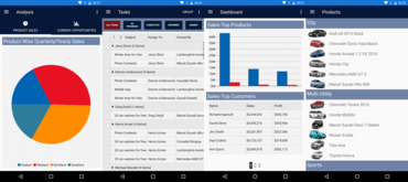
  • New Dashboard Demo
    • An all-new mobile version of the dashboard sample app, displays sales and profit comparison, goals, top products, and customers.
    • Features many of the controls, including FlexChart, FlexPie, FlexGrid, BulletGraph, and CollectionView.
    • Demonstrates using the controls within more complicated multi-page arrangements, including master detail, carousel, and tabbed pages.
    • Displays many of the new control animations.
  • FlexChart
    • Added pan and zoom to FlexPie and Sunburst charts making dense datasets easier to visualize, improving interaction with both chart types and providing an even better experience on mobile.
    • Added new properties to the Axis object of a traditional FlexChart including Scale and DisplayedRange.
    • Animations - Added animations for FlexChart and FlexPie, these animations are available for loading and updating data in these chart types, as well as selection for FlexPie.
  • FlexGrid
    • Added Column/Row Dragging Reordering - One of the most requested features for FlexGrid was the ability drag to reorder rows and columns. This is now available by setting the AllowDragging property.
    • Resizing columns and rows should also feel better in this release, as most of the gesture and touch interactions have been overhauled.
    • New animations accompany reordering your data.
    • Deletion is now based on selection, rather than current cell. Changing the SelectionMode has an impact on what is deleted. Cell-based Selection simply deletes the content of the cell without modifying the CollectionView, though Row-based selection have the rows deleted in both the FlexGrid and CollectionView.
  • Gauge
    • Added the ability to use dragging interactions with gauge controls (Linear Gauge, Radial Gauge, and Bullet Graph) rather than just taps.
  • Improvements to Input controls
    • Added animations for all the DropDown derived controls.
    • Added basic keyboard handling to the controls, so for UWP users and mobile users with a keyboard you should now be able to navigate through the list of items available in a DropDown using the arrow keys, use Enter to begin and end editing, and use the tab key to navigate through tab stops on UWP.
    • Added new properties for customizing the fonts in AutoComplete and ComboBox. There are now FontAttributes, FontSize, and FontFamily properties for configuring these controls.
  • New Project Templates
    • Added a new .NET Standard project template for Visual Studio 2017.
    • Modernize your Xamarin.Forms projects as the .NET platform continues to evolve.
    • Templates should now automatically open up the GrapeCity license manager add in (on platforms that support it) to make licensing your projects more straightforward.

Wijmo Core 2018 v1 (Build 462)

$
0
0
Wijmo Core

Adds support for Angular 6, plus beta release of Wijmo controls as web components.

Features

  • [Angular] Added support for Angular 6.
  • [Web Components] Added Beta version of the web components interop.
  • [Web Components] Added a sample that demonstrates how to use Wijmo web components in an Angular application.
  • [Licensing] Added a wijmo.setLicenseKey method that enables single-build deployment, including npm.
  • [npm] Wijmo is published to the global npm registry as the 'wijmo' package.
  • [Angular] Disabled state of Wijmo components inside Angular forms now changes on the Angular AbstractControl.disable()/enable() method calls.
  • Added Beta version of Wijmo npm image with ES2015 (ES6) code.
  • [wijmo.pdf] Moved to PDFKit 0.8.3.
  • [wijmo.pdf] Added PdfPageArea.openImage() method.
  • The PdfExport samples have been updated to use openImage() method to get the actual image sizes when drawing cells manually.
  • [ReportViewer] Added support for new properties of string parameters, maxLength and allowBlank.
  • PivotGrid now honors the allowDragging property and allows users to reorder the row fields by dragging their column headers.
  • Optimized the FlexGrid.autoSizeRows method.

Fixes

  • [Licensing] Fixed issue of license validation in older versions of Chrome.

ComponentOne Ultimate - updates Wijmo 2018 v1 (Build 462).

$
0
0
ComponentOne Ultimate

Wijmo Build 5.201801.462 adds support for Angular 6, plus a new interop with web components (beta).

Features

New in Wijmo Build 5.201801.462:

  • [Angular] Added support for Angular 6.
  • [Web Components] Added Beta version of the web components interop.
  • [Web Components] Added a sample that demonstrates how to use Wijmo web components in an Angular application.
  • [Licensing] Added a wijmo.setLicenseKey method that enables single-build deployment, including npm.
  • [npm] Wijmo is published to the global npm registry as the 'wijmo' package.
  • [Angular] Disabled state of Wijmo components inside Angular forms now changes on the Angular AbstractControl.disable()/enable() method calls.
  • Added Beta version of Wijmo npm image with ES2015 (ES6) code.
  • [wijmo.pdf] Moved to PDFKit 0.8.3.
  • [wijmo.pdf] Added PdfPageArea.openImage() method.
  • The PdfExport samples have been updated to use openImage() method to get the actual image sizes when drawing cells manually.
  • [ReportViewer] Added support for new properties of string parameters, maxLength and allowBlank.
  • PivotGrid now honors the allowDragging property and allows users to reorder the row fields by dragging their column headers.
  • Optimized the FlexGrid.autoSizeRows method.

Fixes

Fixed in Wijmo Build 5.201801.462:

  • [Licensing] Fixed issue of license validation in older versions of Chrome.

ComponentOne Ultimate 2018 v2

$
0
0
ComponentOne Ultimate

Includes new controls, designers, and enhancements to C1 Studio Enterprise, Wijmo, and C1 Studio for Xamarin.

Features

  • New FlexChart features
    • Added a new Histogram chart type.
    • Added enhancements to animations.
    • Sunburst charts now have new load and update animations
    • Improved the easing functionality on iOS by adding implicit conversion of CAMediaTimingFunction to C1Easing.
  • New ComponentOne Input control features
    • Adde AutoCompleteMode property.
    • Adjust both the filter and highlighting behavior of AutoComplete and allows StartsWith, EndsWith, and Contains (Default).
    • Added the ability to use MatchCase or MatchWholeWordflags in AutoComplete.
    • Added ability to clear data from editable input controls with a clear button. It can be toggled with the ShowClearButton property.
    • New Completed Event for Input controls.
    • Added Animation for FullScreenMode.
  • ComponentOne CollectionView control
    • Added the ability to use MatchCase or MatchWholeWord flags when filtering. The FullTextFilterSample in FlexGrid101 has been modified to demonstrate this behavior.
  • ComponentOne FlexGrid enhancements
    • Added KeyActionTab property for Excel-like tab cycling. This option allows a tab key press to behave the same as in Excel, where a tab will wrap the selection and marquee to the first column of the next row when pressed from the last column of a row.
    • Added customizable selection/context menu.
    • Built in options for actions like Cut, Copy, Paste, Delete, Undo, and Select All.
    • Can also contain developer customizable actions.
    • Improved the visual quality of FlexGrid grid lines and light and dark themes.
  • New Visual Studio for Mac and Entity Framework project templates
    • Added Entity Framework SQLite Template.
    • Uses FlexGrid, CollectionView, and Entity Framework Core with a local SQLite DataBase.
    • Added Visual Studio for Mac templates.
    • Same templates currently in VS 2017 will also be available for Mac (including Entity Framework template).

ComponentOne Studio for Xamarin 2018 v2

$
0
0
New project templates for Visual Studio for Mac.

Now includes project templates for Visual Studio for Mac, plus updates to FlexChart, FlexGrid and Input controls.

Features

  • New FlexChart features
    • Added a new Histogram chart type.
    • Added enhancements to animations.
    • Sunburst charts now have new load and update animations
    • Improved the easing functionality on iOS by adding implicit conversion of CAMediaTimingFunction to C1Easing.
  • New ComponentOne Input control features
    • Adde AutoCompleteMode property.
    • Adjust both the filter and highlighting behavior of AutoComplete and allows StartsWith, EndsWith, and Contains (Default).
    • Added the ability to use MatchCase or MatchWholeWordflags in AutoComplete.
    • Added ability to clear data from editable input controls with a clear button. It can be toggled with the ShowClearButton property.
    • New Completed Event for Input controls.
    • Added Animation for FullScreenMode.
  • ComponentOne CollectionView control
    • Added the ability to use MatchCase or MatchWholeWord flags when filtering. The FullTextFilterSample in FlexGrid101 has been modified to demonstrate this behavior.
  • ComponentOne FlexGrid enhancements
    • Added KeyActionTab property for Excel-like tab cycling. This option allows a tab key press to behave the same as in Excel, where a tab will wrap the selection and marquee to the first column of the next row when pressed from the last column of a row.
    • Added customizable selection/context menu.
    • Built in options for actions like Cut, Copy, Paste, Delete, Undo, and Select All.
    • Can also contain developer customizable actions.
    • Improved the visual quality of FlexGrid grid lines and light and dark themes.
  • New Visual Studio for Mac and Entity Framework project templates
    • Added Entity Framework SQLite Template.
    • Uses FlexGrid, CollectionView, and Entity Framework Core with a local SQLite DataBase.
    • Added Visual Studio for Mac templates.
    • Same templates currently in VS 2017 will also be available for Mac (including Entity Framework template).

ComponentOne Studio ASP.NET MVC 2018 v2

$
0
0
New support for Excel-like tables.

Adds multi-line editing to FlexGrid, plus support for Excel-like tables in FlexSheet.

Features

New Controls

  • Build BI dashboards with Dashboard Layout
    • Embed ComponentOne's data controls and design dynamic screens and business intelligence dashboards with the interactive Dashboard Layout control. You can choose layouts that fit your screen requirements, and built-in features like drag and drop, maximize and restore, save and load layouts, and conversion of existing layouts provide a powerful layout system.
  • TabPanel for ASP.NET MVC
    • The TabPanel navigation control, released in Wijmo v1, has now been wrapped for ASP.NET MVC and ASP.NET Core apps. It's a simple, effective navigation control that allows the user to move between refreshed content views. Controls can be embedded into the panels.

Data Visualization Enhancements
FlexChart has added several new charts to the collection of over 80 charts and variations.

  • HeatMap chart - This specialized chart represents data values using colors, and is especially useful in plotting large, complex data. Customizations include gradient color scale, gradient color axis, and a discrete color scale.
  • New histogram variations
    • Frequency Polygon, a variation of histogram chart where the columns are replaced by a curve that's helpful for comparing multiple sets of data.
    • Gaussian/Bell curve, a bell-shaped curve in histogram chart that shows the probability distribution of a continuous random variable.
    • Cumulative mode, a variation in histogram and Frequency Polygon chart that shows the running total of frequencies on the chart.
  • Axis enhancements
    • Automatic AxisGrouping for DateTime axis
    • Expand/collapse axis groups
    • Provision for specifying calendar periods as Major/Minor units
    • Provision for specifying Min/Max axis labels
  • Additional enhancements
    • Line Marker: Allows moving/dragging of line markers after its horizontal/vertical positions has been changed
    • FlexChart for WinForms: Improved Area chart performance for large data points in DirectX mode
    • FlexChart for Xamarin improvements
      • Improved iOS animation by adding implicit conversion from CAMediaTimingFunction to C1Easing
      • Improved designer appearance of Sunburst
      • Added Histogram chart
  • New overlay in FinancialChart*
    • FinancialChart now supports ichimoku cloud, an overlay designed to tell everything at one glance about the price trend, including its direction, momentum, dynamic support and resistance levels, and even trade signals.

* Available only in ComponentOne Studio and ComponentOne Ultimate.

Platform Enhancements - ASP.NET MVC

  • New controls! TabPanel and Dashboard Layout; see above.
  • Material Theme Designer Sample
    • This interactive sample allows you to select primary and accent colors for your app, and produces the CSS you'll need to implement the styles for a Material Design app.
  • FlexGrid Multi-line editing
    • By setting a column's multiline property to true, you can implement multi-line editing in a single FlexGrid cell. The control now recognizes a newline character (/n), and ALT+ENTER now acts as a line break, as in Excel.
  • FlexSheet support for Excel-like tables
    • ASP.NET MVC's lightweight spreadsheet, FlexSheet, now supports Excel-like tables for selected ranges of cells. You can bind data directly to the table in the data source.
  • Microsoft SSAS Cube support in OLAP
    • Wijmo's support for SSAS Cubes has come to ASP.NET MVC! The ASP.NET MVC PivotEngine now allows you to connect directly to OLAP cubes provided by SSAS servers. Previously, a DataEngine WebAPI was required to connect to SSAS Cubes, and now that's built directly into the OLAP control. You can continue to use DataEngine WebAPI to analyze very large datasets from varied sources. OLAP control is included in ComponentOne Studio Enterprise.
  • FlexViewer supports ActiveReports
    • ASP.NET MVC FlexViewer now supports ActiveReports. Set the ActiveReports ServiceURL, FilePath, and ReportName properties in FlexViewer to view ActiveReports. In addition, PdfDocumentSource now supports CFF Fonts. If you have PDF Files that use CFF Fonts, these files will now load correctly in FlexViewer in all platforms.

ComponentOne Studio WPF 2018 v2

$
0
0
New HeatMap chart.

Adds new HeatMap chart to FlexChart and enhancements to MultiSelect and Expression Editor.

Features

Data Visualization Enhancements
FlexChart has added several new charts to the collection of over 80 charts and variations.

  • HeatMap chart - This specialized chart represents data values using colors, and is especially useful in plotting large, complex data. Customizations include gradient color scale, gradient color axis, and a discrete color scale.
  • New histogram variations
    • Frequency Polygon, a variation of histogram chart where the columns are replaced by a curve that's helpful for comparing multiple sets of data.
    • Gaussian/Bell curve, a bell-shaped curve in histogram chart that shows the probability distribution of a continuous random variable.
    • Cumulative mode, a variation in histogram and Frequency Polygon chart that shows the running total of frequencies on the chart.
  • Axis enhancements
    • Automatic AxisGrouping for DateTime axis
    • Expand/collapse axis groups
    • Provision for specifying calendar periods as Major/Minor units
    • Provision for specifying Min/Max axis labels
  • Additional enhancements
    • Line Marker: Allows moving/dragging of line markers after its horizontal/vertical positions has been changed
    • FlexChart for WinForms: Improved Area chart performance for large data points in DirectX mode
    • FlexChart for Xamarin improvements
      • Improved iOS animation by adding implicit conversion from CAMediaTimingFunction to C1Easing
      • Improved designer appearance of Sunburst
      • Added Histogram chart
  • New overlay in FinancialChart*
    • FinancialChart now supports ichimoku cloud, an overlay designed to tell everything at one glance about the price trend, including its direction, momentum, dynamic support and resistance levels, and even trade signals.

* Available only in ComponentOne Studio and ComponentOne Ultimate.

Platform Enhancements - WPF

  • MultiSelect enhancements
    • Group feature
    • Keyboard support
    • Themes support
    • New AutoCompleteMode and AutoSuggestMode properties
  • Expres​​​sion Editor enhancements
    • Added toolbar button for quotes
    • Added the ability to remove items from 'Category Selection' in C1ExpressionEditorPanel
    • Added support for custom functions
  • Additional enhancements
    • DataGrid for WPF: Added keyboard shortcut for Cut (Ctrl+X) function in C1DataGrid
    • TreeView for WPF: Added support for external Drag&Drop using and firing standard Drag&Drop events
    • Input​ for WPF: Added a property in C1MenuItem that’s the same as InputGestureText of MS MenuItem
    • PdfDocumentSource now supports CFF Fonts. If you have PDF Files that use CFF Fonts, these files will now load correctly in FlexViewer in all platforms.
    • FlexChart includes new charts mentioned above.

ComponentOne Studio UWP 2018 v2

$
0
0
New histogram variations.

Adds new histogram variations to FlexChart, plus improvements to MultiSelect and Expression Editor.

Features

Data Visualization Enhancements
FlexChart has added several new charts to the collection of over 80 charts and variations.

  • HeatMap chart - This specialized chart represents data values using colors, and is especially useful in plotting large, complex data. Customizations include gradient color scale, gradient color axis, and a discrete color scale.
  • New histogram variations
    • Frequency Polygon, a variation of histogram chart where the columns are replaced by a curve that's helpful for comparing multiple sets of data.
    • Gaussian/Bell curve, a bell-shaped curve in histogram chart that shows the probability distribution of a continuous random variable.
    • Cumulative mode, a variation in histogram and Frequency Polygon chart that shows the running total of frequencies on the chart.
  • Axis enhancements
    • Automatic AxisGrouping for DateTime axis
    • Expand/collapse axis groups
    • Provision for specifying calendar periods as Major/Minor units
    • Provision for specifying Min/Max axis labels
  • Additional enhancements
    • Line Marker: Allows moving/dragging of line markers after its horizontal/vertical positions has been changed
    • FlexChart for WinForms: Improved Area chart performance for large data points in DirectX mode
    • FlexChart for Xamarin improvements
      • Improved iOS animation by adding implicit conversion from CAMediaTimingFunction to C1Easing
      • Improved designer appearance of Sunburst
      • Added Histogram chart
  • New overlay in FinancialChart*
    • FinancialChart now supports ichimoku cloud, an overlay designed to tell everything at one glance about the price trend, including its direction, momentum, dynamic support and resistance levels, and even trade signals.

* Available only in ComponentOne Studio and ComponentOne Ultimate.

Platform Enhancements - UWP

  • MultiSelect enhancements
    • Group feature
    • Keyboard support
    • New AutoCompleteMode and AutoSuggestMode properties
  • Expres​​​sion Editor enhancements
    • Added toolbar button for quotes
    • Added the ability to remove items from 'Category Selection' in C1ExpressionEditorPanel
    • Added support for custom functions
  • Additional enhancements
    • PdfDocumentSource now supports CFF Fonts. If you have PDF Files that use CFF Fonts, these files will now load correctly in FlexViewer in all platforms.
    • FlexChart includes new charts mentioned above.

ComponentOne Studio WinForms 2018 v2

$
0
0
New Dashboard Layout for WinForms.

Build BI dashboards with the new interactive Dashboard Layout control.

Features

New Controls

  • Build BI dashboards with Dashboard Layout for WinForms and ASP.NET MVC
    • Embed ComponentOne's data controls and design dynamic screens and business intelligence dashboards with the interactive Dashboard Layout control. You can choose layouts that fit your screen requirements, and built-in features like drag and drop, maximize and restore, save and load layouts, and conversion of existing layouts provide a powerful layout system.
  • New Barcodes in WinForms, WPF, and UWP including:
    • Code 11
    • SSCC 18
    • HIBCode128
    • HIBCode39
    • ISBN
    • ISSN
    • ISMN
    • Iata25
    • BC 412
    • PZN
    • Plessey
    • Pharmacode
    • IntelligentMailPackage
    • Telepen
    • ITF 14

Data Visualization Enhancements
FlexChart has added several new charts to the collection of over 80 charts and variations.

  • HeatMap chart - This specialized chart represents data values using colors, and is especially useful in plotting large, complex data. Customizations include gradient color scale, gradient color axis, and a discrete color scale.
  • New histogram variations
    • Frequency Polygon, a variation of histogram chart where the columns are replaced by a curve that's helpful for comparing multiple sets of data.
    • Gaussian/Bell curve, a bell-shaped curve in histogram chart that shows the probability distribution of a continuous random variable.
    • Cumulative mode, a variation in histogram and Frequency Polygon chart that shows the running total of frequencies on the chart.
  • Axis enhancements
    • Automatic AxisGrouping for DateTime axis
    • Expand/collapse axis groups
    • Provision for specifying calendar periods as Major/Minor units
    • Provision for specifying Min/Max axis labels
  • Additional enhancements
    • Line Marker: Allows moving/dragging of line markers after its horizontal/vertical positions has been changed
    • FlexChart for WinForms: Improved Area chart performance for large data points in DirectX mode
    • FlexChart for Xamarin improvements
      • Improved iOS animation by adding implicit conversion from CAMediaTimingFunction to C1Easing
      • Improved designer appearance of Sunburst
      • Added Histogram chart
  • New overlay in FinancialChart*
    • FinancialChart now supports ichimoku cloud, an overlay designed to tell everything at one glance about the price trend, including its direction, momentum, dynamic support and resistance levels, and even trade signals.

Platform Enhancements - WinForms

  • FlexGrid Dynamic Grouping
    • Dynamic grouping automatically sorts the data, splits it into groups, and adds collapsible group rows above or below each group. The group rows may include aggregate values for one or more columns. Grouping can make this data easier to understand, navigate, and analyze. You can add grouping using the new GroupDescriptions property.
  • FlexGrid Group Panel
    • Dynamic grouping was expanded to include a Group Panel control, which enables run time grouping in FlexGrid. You can drag column headers into the panel to create groups, drag groups to new positions, and use the context menu to collapse all, expand all, or clear grouping.
  • FlexGrid star-sizing
    • The latest version of the FlexGrid control for WinForms adds a powerful and convenient feature that has been available in other versions of the FlexGrid for quite a while: star-sizing. Star-sizing allows you to specify the width of a column with respect to the total width available.
  • MultiSelect enhancements
    • MultiSelect now supports an Auto Suggest Mode and AutoCompleteMode feature that helps users search an item in the MultiSelect. The AutoSuggest mode has three options: Default, StartsWith and Contains. The AutoCompleteMode has Suggest, Append and SuggestAppend options.
  • Scheduler includes table view and agenda view
    • Scheduler's new samples include Office 2016 table and agenda views. TableView displays appointments in a table view that can be grouped, sorting, or filtered as specified by the developer or end user. It's similar to the Outlook 2016 List and Active views
    • AgendaView displays appointments grouped by date in a table view where a single table row represents a single appointment. Users can edit appointments by double-clicking on an appointment and opening the EditAppointment dialog. This view is always sorted by dates in ascending order, and doesn’t have row or column headers.
  • Additional enhancements
    • FlexPivot* includes new ShowAS functions that improve compatibility between cross-platform FlexPivot implementations.
    • Barcode additions mentioned above .
    • PdfDocumentSource now supports CFF Fonts. If you have PDF Files that use CFF Fonts, these files will now load correctly in FlexViewer in all platforms.
    • FlexChart includes new charts mentioned above.

* Aavailable only in ComponentOne Studio and ComponentOne Ultimate.

ComponentOne Studio Enterprise 2018 v2

$
0
0
ComponentOne Studio Enterprise

Adds new Dashboard Layout control, new charts, grid enhancements and more.

Features

New Controls

  • Build BI dashboards with Dashboard Layout for WinForms and ASP.NET MVC
    • Embed ComponentOne's data controls and design dynamic screens and business intelligence dashboards with the interactive Dashboard Layout control. You can choose layouts that fit your screen requirements, and built-in features like drag and drop, maximize and restore, save and load layouts, and conversion of existing layouts provide a powerful layout system.
  • TabPanel for ASP.NET MVC
    • The TabPanel navigation control, released in Wijmo v1, has now been wrapped for ASP.NET MVC and ASP.NET Core apps. It's a simple, effective navigation control that allows the user to move between refreshed content views. Controls can be embedded into the panels.
  • New Barcodes in WinForms, WPF, and UWP including:
    • Code 11
    • SSCC 18
    • HIBCode128
    • HIBCode39
    • ISBN
    • ISSN
    • ISMN
    • Iata25
    • BC 412
    • PZN
    • Plessey
    • Pharmacode
    • IntelligentMailPackage
    • Telepen
    • ITF 14

Data Visualization Enhancements
FlexChart has added several new charts to the collection of over 80 charts and variations.

  • HeatMap chart - This specialized chart represents data values using colors, and is especially useful in plotting large, complex data. Customizations include gradient color scale, gradient color axis, and a discrete color scale.
  • New histogram variations
    • Frequency Polygon, a variation of histogram chart where the columns are replaced by a curve that's helpful for comparing multiple sets of data.
    • Gaussian/Bell curve, a bell-shaped curve in histogram chart that shows the probability distribution of a continuous random variable.
    • Cumulative mode, a variation in histogram and Frequency Polygon chart that shows the running total of frequencies on the chart.
  • Axis enhancements
    • Automatic AxisGrouping for DateTime axis
    • Expand/collapse axis groups
    • Provision for specifying calendar periods as Major/Minor units
    • Provision for specifying Min/Max axis labels
  • Additional enhancements
    • Line Marker: Allows moving/dragging of line markers after its horizontal/vertical positions has been changed
    • FlexChart for WinForms: Improved Area chart performance for large data points in DirectX mode
    • FlexChart for Xamarin improvements
      • Improved iOS animation by adding implicit conversion from CAMediaTimingFunction to C1Easing
      • Improved designer appearance of Sunburst
      • Added Histogram chart
  • New overlay in FinancialChart
    • FinancialChart now supports ichimoku cloud, an overlay designed to tell everything at one glance about the price trend, including its direction, momentum, dynamic support and resistance levels, and even trade signals.

Platform Enhancements

WinForms

  • FlexGrid Dynamic Grouping
    • Dynamic grouping automatically sorts the data, splits it into groups, and adds collapsible group rows above or below each group. The group rows may include aggregate values for one or more columns. Grouping can make this data easier to understand, navigate, and analyze. You can add grouping using the new GroupDescriptions property.
  • FlexGrid Group Panel
    • Dynamic grouping was expanded to include a Group Panel control, which enables run time grouping in FlexGrid. You can drag column headers into the panel to create groups, drag groups to new positions, and use the context menu to collapse all, expand all, or clear grouping.
  • FlexGrid star-sizing
    • The latest version of the FlexGrid control for WinForms adds a powerful and convenient feature that has been available in other versions of the FlexGrid for quite a while: star-sizing. Star-sizing allows you to specify the width of a column with respect to the total width available.
  • MultiSelect enhancements
    • MultiSelect now supports an Auto Suggest Mode and AutoCompleteMode feature that helps users search an item in the MultiSelect. The AutoSuggest mode has three options: Default, StartsWith and Contains. The AutoCompleteMode has Suggest, Append and SuggestAppend options.
  • Scheduler includes table view and agenda view
    • Scheduler's new samples include Office 2016 table and agenda views. TableView displays appointments in a table view that can be grouped, sorting, or filtered as specified by the developer or end user. It's similar to the Outlook 2016 List and Active views
    • AgendaView displays appointments grouped by date in a table view where a single table row represents a single appointment. Users can edit appointments by double-clicking on an appointment and opening the EditAppointment dialog. This view is always sorted by dates in ascending order, and doesn’t have row or column headers.
  • Additional enhancements
    • FlexPivot includes new ShowAS functions that improve compatibility between cross-platform FlexPivot implementations.
    • Barcode additions mentioned above .
    • PdfDocumentSource now supports CFF Fonts. If you have PDF Files that use CFF Fonts, these files will now load correctly in FlexViewer in all platforms.
    • FlexChart includes new charts mentioned above.

WPF & UWP

  • MultiSelect enhancements
    • Group feature
    • Keyboard support
    • Themes support (WPF only)
    • New AutoCompleteMode and AutoSuggestMode properties
  • Expres​​​sion Editor enhancements
    • Added toolbar button for quotes
    • Added the ability to remove items from 'Category Selection' in C1ExpressionEditorPanel
    • Added support for custom functions
  • Additional enhancements
    • DataGrid for WPF: Added keyboard shortcut for Cut (Ctrl+X) function in C1DataGrid
    • TreeView for WPF: Added support for external Drag&Drop using and firing standard Drag&Drop events
    • Input​ for WPF: Added a property in C1MenuItem that’s the same as InputGestureText of MS MenuItem
    • PdfDocumentSource now supports CFF Fonts. If you have PDF Files that use CFF Fonts, these files will now load correctly in FlexViewer in all platforms.
    • FlexChart includes new charts mentioned above.

ASP.NET MVC

  • New controls! TabPanel and Dashboard Layout; see above.
  • Material Theme Designer Sample
    • This interactive sample allows you to select primary and accent colors for your app, and produces the CSS you'll need to implement the styles for a Material Design app.
  • FlexGrid Multi-line editing
    • By setting a column's multiline property to true, you can implement multi-line editing in a single FlexGrid cell. The control now recognizes a newline character (/n), and ALT+ENTER now acts as a line break, as in Excel.
  • FlexSheet support for Excel-like tables
    • ASP.NET MVC's lightweight spreadsheet, FlexSheet, now supports Excel-like tables for selected ranges of cells. You can bind data directly to the table in the data source.
  • Microsoft SSAS Cube support in OLAP
    • Wijmo's support for SSAS Cubes has come to ASP.NET MVC! The ASP.NET MVC PivotEngine now allows you to connect directly to OLAP cubes provided by SSAS servers. Previously, a DataEngine WebAPI was required to connect to SSAS Cubes, and now that's built directly into the OLAP control. You can continue to use DataEngine WebAPI to analyze very large datasets from varied sources. OLAP control is included in ComponentOne Studio Enterprise.
  • FlexViewer supports ActiveReports
    • ASP.NET MVC FlexViewer now supports ActiveReports. Set the ActiveReports ServiceURL, FilePath, and ReportName properties in FlexViewer to view ActiveReports. In addition, PdfDocumentSource now supports CFF Fonts. If you have PDF Files that use CFF Fonts, these files will now load correctly in FlexViewer in all platforms.

Wijmo Core 2018 v2

$
0
0
New React/Redux Cryptocurrency Tracking Application in Wijmo.

Includes new React/Redux reference application, Design Time for Wijmo Controls and SASS support.

Features

  • Design Time for Wijmo Controls - Until now, Wijmo controls were easy to use, but still required writing code. The 2018 v2 release introduces design-time environments for creating and customizing Wijmo controls. Currently available as two beta products for using a design surface similar to Visual Studio, including a live preview and property grid. The two designers are:
    • New Wijmo Designer for Angular in VSCode (Beta) - This designer is an extension for VSCode. When installed, it adds a "Wijmo Designer…" action above each Angular Wijmo component. When the action button is clicked, it opens up a design surface for customizing that specific component. You can change properties, bind events and save your changes back to the Angular application.
    • New Wijmo Designer for PureJS (Beta) - This designer is a web application for creating and customizing Wijmo controls. You can run this designer in any browser. It allows you to add controls to the design surface and then customize them to your liking. Once finished, you can copy the generated code into your own application. The generated code from this designer is plain HTML and JavaScript. The generated code includes the references, host element, and JavaScript needed to initialize the controls.
  • SASS Support for Controls and Themes - Rewritten control styles (layout, default styling) using SASS for simplification and better organization:
    • Easily use the SASS files to create your own themes. SASS files are provided for you to use and customize as you like.
    • Choose which SASS modules you want to include in your application. For example, there is now a Wijmo-Core file that only includes the core modules (not enterprise) and it's only a fraction of the size. You can really optimize your CSS size by selectively choosing what to include.
  • New React/Redux Cryptocurrency Tracking Application - Introducing a real-world reference application for Wijmo that uses React and Redux. The application is a financial dashboard for tracking cryptocurrency values. It uses modern design patters for React/Redux and a variety of Wijmo controls, and should help you evaluate and develop Wijmo apps.
  • Vue 2 Interop Enhancements - As Vue continues to gain popularity, Wijmo improves its interopability. This release adds some enhancements to Vue 2 support. Most significantly, child components now correctly work in dynamic scenarios like along with the v-for and v-if directives. GrapeCity have also added components like WjFlexGridDetail, numerous child components, and some new samples.
  • Added ES6 and ESModule support.
  • Web Components in Wijmo:
    • Introduces a beta version of the Wijmo web components interop, which exposes Wijmo controls as web components, or more specifically as custom elements.
    • Wijmo web components allows you to declaratively add Wijmo controls to HTML page, and manipulate them as usual DOM elements, without the use of any additional framework.
    • One of the benefits of web components is that the same component can be used in different frameworks and benefit from the frameworks’ additional capabilities like attribute, property, and event bindings.
    • New 'Web Components In Angular' sample demonstrates how to use Wijmo web components in Angular apps. Samples for other popular frameworks like React, Vue, Polymer, and others are on the way.

ComponentOne Ultimate - includes Wijmo 2018 v2 (Build 523)

$
0
0
New submenu and BI PWA samples added to Wijmo.

Wijmo adds business intelligence PWA sample, submenu support for Menu, plus PDF performance enhancements.

Features

Updates in Wijmo 2018 v2 (Build 523)

  • Added new business intelligence PWA sample - Progressive Web Apps (PWAs) are regular web apps that behave like native applications on mobile devices. They can be installed, open quickly, and can operate without a network connection. GrapeCity created a MyBI sample app to show how easy it can be to build progressive web apps using Wijmo. It gets sales data stored in a Google Sheet and creates a dashboard to support business decisions.
  • WebComponents - Added Beta version of the WebComponents interop. The new Samples\TS\WebComponents\WebComponentsIntro sample explains the status and usage of the interop.
  • [npm] Wijmo is published to the global npm registry as the wijmo package.
  • Added new HierarchicalMenu sample that demonstrates how to use the new submenu feature of the Menu control.
  • Added new DropDownTree sample that demonstrates how to show a TreeView in the drop-down.
  • [Menu] Added a Menu.subItemsPath property that allows the creation of hierarchical (multi-level) menus. This is similar to the childItemsPath property in the FlexGrid and TreeView controls. The Menu.subItemsPath property specifies the name of a property that is used to populate child menus when the parent item is clicked.
  • [Menu] Added a Menu.openOnHover property that causes the menu (and any sub-menus) to open and close automatically when the mouse hovers over the control.
  • [wijmo.pdf][wijmo.grid.pdf] Improved performance, memory consumption is reduced.
  • Improved accessibility for grids with imeEnabled (made IME element aria-invisible).
  • Improved RTL support in Calendar/DropDown/Popup controls.
  • Improved touch support on input (don't show the soft keyboard when picking from drop-downs) and gauge controls (allow touch-scrolling on read-only gauges).
  • Improved clipboard support in MultiRow. Before, it would copy duplicate values for merged cells. Now, it copies only the first cell in the merged range and the remaining merged cells are replaced by empty strings (as in Excel).
  • Added support for popups in HTML elements.

Wijmo Core 2018 v2 (Build 523)

$
0
0
New business intelligence PWA sample.

Adds business intelligence PWA sample, submenu support for Menu, plus PDF performance enhancements.

Features

  • Added new business intelligence PWA sample - Progressive Web Apps (PWAs) are regular web apps that behave like native applications on mobile devices. They can be installed, open quickly, and can operate without a network connection. GrapeCity created a MyBI sample app to show how easy it can be to build progressive web apps using Wijmo. It gets sales data stored in a Google Sheet and creates a dashboard to support business decisions.
  • WebComponents - Added Beta version of the WebComponents interop. The new Samples\TS\WebComponents\WebComponentsIntro sample explains the status and usage of the interop.
  • [npm] Wijmo is published to the global npm registry as the wijmo package.
  • Added new HierarchicalMenu sample that demonstrates how to use the new submenu feature of the Menu control.
  • Added new DropDownTree sample that demonstrates how to show a TreeView in the drop-down.
  • [Menu] Added a Menu.subItemsPath property that allows the creation of hierarchical (multi-level) menus. This is similar to the childItemsPath property in the FlexGrid and TreeView controls. The Menu.subItemsPath property specifies the name of a property that is used to populate child menus when the parent item is clicked.
  • [Menu] Added a Menu.openOnHover property that causes the menu (and any sub-menus) to open and close automatically when the mouse hovers over the control.
  • [wijmo.pdf][wijmo.grid.pdf] Improved performance, memory consumption is reduced.
  • Improved accessibility for grids with imeEnabled (made IME element aria-invisible).
  • Improved RTL support in Calendar/DropDown/Popup controls.
  • Improved touch support on input (don't show the soft keyboard when picking from drop-downs) and gauge controls (allow touch-scrolling on read-only gauges).
  • Improved clipboard support in MultiRow. Before, it would copy duplicate values for merged cells. Now, it copies only the first cell in the merged range and the remaining merged cells are replaced by empty strings (as in Excel).
  • Added support for popups in HTML elements.
Viewing all 166 articles
Browse latest View live


<script src="https://jsc.adskeeper.com/r/s/rssing.com.1596347.js" async> </script>